Customizing the Appearance
Overview
The AppearanceStyle property controls the general look of the Spread control.
The setting for the appearance style determines which properties or methods can be used for customizing the control appearance.
A new, default Spread control will use the enhanced appearance style. An upgraded Spread control will use the classic style.The following image displays the new, default appearance:

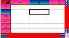
The enhanced style allows you to use several enhanced methods to customize the control. The methods are the SetEnhancedColumnHeaderColors, SetEnhancedCornerColors, SetEnhancedRowHeaderColors, SetEnhancedScrollBarColors, and SetEnhancedSheetTabColors. You can use these methods to customize the headers, corner of the control, scroll bars, and sheet tabs.
The following image shows a Spread control that uses the enhanced methods:

The headers of the active cell or selected block can be highlighted. By default the header highlight is based on the AppearanceStyle property. The header highlight is not used if the style is classic. The HighlightHeaders property can be used to display a highlight for the header.
You can also customize the style of the highlight for the selected cells. The HighlightStyle property allows you to use the inverse of the cell color, SelBackColor and SelForeColor, or the alpha blend option. You can specify the alpha blend color with the HighlightAlphaBlendColor property and you can specify the alpha value for blending with the HighlightAlphaBlend property.
If you wish to keep the classic appearance for buttons (button cells, check box cells, combo cells, and spin buttons) while using the enhanced appearance for the control, you can set the UseVisualStyles property.
Static text cells can also use the enhanced or visual style of the AppearanceStyle property if the EnhanceStaticCells property is set to true.
The ScrollBarStyle property can be used to display the scroll bars with different settings from the AppearanceStyle property. If you set the scroll bar style to classic, use the ScrollBarVColor and/or ScrollBarHColor properties if you wish to change the scroll bar colors (use the SetEnhancedScrollBarColors method for the enhanced style).


