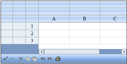
You can customize the appearance of the sheet corner, the header cell in the upper left corner of the sheet, for each sheet. Sheet corners can display grid lines, have a different background color from the rest of the headers, and more. You can set the style of the sheet corner. You can set the style of the sheet corner as you would any cell in the spreadsheet and you can set the text that appears in the corner. Any of the properties of the StyleInfo object can be set for the cells in the corner of the sheet. In the following figure, the sheet corner uses default values (the sheet corner row and column count have been set to three).

Sheet corners can display grid lines, have a different background color from the rest of the headers, and more. There are several different ways to set properties in the sheet corner. One way is with the SheetCorner class. Another option is to set the sheet corner properties for the SheetView class.
The parts of the API that affect the sheet corner include:
- FpSpread SheetCorner Property
- SheetView AllowTableCorner Property
- SheetView SheetCorner Property
- SheetView SheetCornerStyle Property
- SheetView SheetCornerStyleName Property
- SheetCorner Class - all members
Several of the StyleInfo object properties can be set for the sheet corner cell. These properties include:
- background color - the background color of the cell
- border - the border around the cell
- cell type - the type of cell (see
- font - the font settings of the cell
- text color - the color of text color in the cell
- alignment - the alignment of text in the cell (horizontal and vertical)
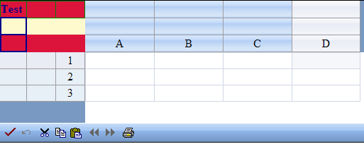
The figure below shows an example (see the example code below) that specifies a sheet corner with alternating row colors and a column border.

Return to the sheet appearance overview at Customizing the Appearance of the Sheet.
Using Shortcut Object
- Set the given property of the sheet corner style (SheetCornerStyle property) of the FpSpread component Sheets shortcut.
Example
This example code sets the text, border colors, text colors, and row colors.
| C# |  Copy Code Copy Code |
|---|---|
FarPoint.Web.Spread.StyleInfo altrowstyle = new FarPoint.Web.Spread.StyleInfo(); altrowstyle.BackColor = System.Drawing.Color.LemonChiffon; altrowstyle.ForeColor = System.Drawing.Color.Navy; altrowstyle.Font.Bold = true; FpSpread1.Sheets[0].AllowTableCorner = true; FpSpread1.Sheets[0].SheetCorner.RowCount = 3; FpSpread1.Sheets[0].SheetCorner.ColumnCount = 3; FpSpread1.Sheets[0].SheetCorner.AlternatingRows[0].BackColor = System.Drawing.Color.Crimson; FpSpread1.Sheets[0].SheetCorner.Cells[0, 0].Text = "Test"; FpSpread1.Sheets[0].SheetCorner.Columns[0].Border = new FarPoint.Web.Spread.Border(System.Web.UI.WebControls.BorderStyle.Double, System.Drawing.Color.DarkBlue, 2); FpSpread1.Sheets[0].SheetCorner.Rows[0].Border = new FarPoint.Web.Spread.Border(System.Drawing.Color.Green); FpSpread1.Sheets[0].SheetCornerStyle = new FarPoint.Web.Spread.StyleInfo(altrowstyle); |
|
| VB |  Copy Code Copy Code |
|---|---|
Dim altrowstyle As New FarPoint.Web.Spread.StyleInfo() altrowstyle.BackColor = Drawing.Color.LemonChiffon altrowstyle.ForeColor = Drawing.Color.Navy altrowstyle.Font.Bold = True FpSpread1.Sheets(0).AllowTableCorner = True FpSpread1.Sheets(0).SheetCorner.RowCount = 3 FpSpread1.Sheets(0).SheetCorner.ColumnCount = 3 FpSpread1.Sheets(0).SheetCorner.AlternatingRows(0).BackColor = Drawing.Color.Crimson FpSpread1.Sheets(0).SheetCorner.Cells(0, 0).Text = "Test" FpSpread1.Sheets(0).SheetCorner.Columns(0).Border = New FarPoint.Web.Spread.Border(System.Web.UI.WebControls.BorderStyle.Double, Drawing.Color.DarkBlue, 2) FpSpread1.Sheets(0).SheetCorner.Rows(0).Border = New FarPoint.Web.Spread.Border(Drawing.Color.Green) FpSpread1.Sheets(0).SheetCornerStyle = New FarPoint.Web.Spread.StyleInfo(altrowstyle) |
|
Using the Spread Designer
- Select the sheet tab for the sheet for which you want to display the sheet corner.
- Select the Settings menu.
- Select the Header Editor icon in the Other Settings section.
- Select Sheet Corner in the Selected Header drop-down box.
- Set the the various formatting properties in the property grid.
- From the File menu choose Apply and Exit to apply your changes to the component and exit Spread Designer.


