


You can use a combo box cell to display an editable drop-down list -- allowing the user to type in values as well as choosing from a displayed list. You can specify the list of items, whether to include icons to appear along with text, the number that is displayed at any time, and whether the cell is editable by the user.
|
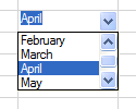
Text only |
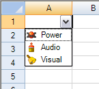
Text and icon |
|---|---|
|
|
|
To create a cell that acts like a combo box, use the ComboBoxCellType class. Create a combo box cell using the following procedure.
Customizing the List Appearance
Here is a summary of the appearance properties that you can use to customize the combo box.
|
Property |
Description |
|---|---|
|
This property lets you set an image to paint in the background of the edit portion of the combo box. |
|
|
This property lets you set where buttons are displayed. |
|
|
This property lets you set an image list for displaying icons along with text in the drop-down list in the combo box. |
|
|
This property lets you set item data, which is different from the items that are displayed, for the drop-down list in the combo box. |
|
|
This property lets you set items for the drop-down list in the combo box. |
|
|
This property lets you set the side of the cell on which the list aligns. |
|
|
This property lets you set how many pixels to offset the list from the aligned edge of the cell. |
|
|
This property lets you set the width (in pixels) of the drop-down list. |
|
|
This property lets you set the number of items to display at one time in the list portion. If there are more items than are displayed, a vertical scroll bar is displayed. |
|
|
This property lets you set the maximum number of characters allowed in the combo box cell. |
Customizing the List Operation
Here is a summary of the operation properties that you can use to customize the combo box.
|
Property |
Description |
|---|---|
|
AcceptsArrowKeys |
Set how arrow keys are processed by the combo box control. |
|
AutoSearch |
Set how a list of items in a combo box is searched based on input of a character key. |
|
CharacterCasing |
Set the case of characters in the text cell. |
|
CharacterSet |
Set what characters to allow for the text cell. |
|
Editable |
Set whether you can type into the edit portion of the combo box. |
|
EditorValue |
Set what value is written to the underlying data model. |
|
ListControl |
Set the control to use for the list portion if you do not want to use the built-in list control in Spread. |
The Spread control has a ButtonDrawMode property for button cells and combo box cells. This property allows you to always show a button, or show buttons in the current column, row, or cell.
Customizing Automatic Completion
Here is a summary of the properties that you can use to customize the automatic completion feature in combo box cells when using the 2005 build of the component.
|
Property |
Description |
|---|---|
|
AutoCompleteCustomSource |
Set the custom source (strings) for automatic completion of entries in the combo box. |
|
AutoCompleteMode |
Set the mode for automatic completion of entries in the combo box. |
|
AutoCompleteSource |
Set the source for automatic completion of entries in the combo box. |
See Also
Note that some graphical elements in certain cell types are affected by XP themes (visual styles). Setting the VisualStyles property of the Spread component to "off" can allow visual customizations of those graphical cell types to work as expected. For more information, refer to Using XP Themes with the Component.
To display a text tip over a combo box cell, see the note in Displaying Text Tips in a Cell.
The 2002 build of the component has an AutoComplete property with two options (none or append).
For more information on the properties and methods of this cell type, refer to the ComboBoxCellType class. For information on the multiple-column combo box, refer to Setting a Multiple-Column Combo Box Cell.
For more information on other graphical cell types, refer to Working with Graphical Cell Types.
Using the Properties Window
- At design time, in the Properties window, select the Spread component.
- Select the Sheets property.
- Click the button to display the SheetView Collection Editor.
- In the Members list, select the sheet in which the cells appear.
- In the property list, select the Cells property and then click the button to display the Cell, Column, and Row Editor.
- Select the cells for which you want to set the cell type.
- In the property list, select the CellType property and choose the ComboBox cell type.
- Expand the list of properties under the CellType property. Select and set these specific properties as needed.
- Click OK to close the Cell, Column, and Row Editor.
- Click OK to close the SheetView Collection Editor.
Using Code
- Define a combo box cell by creating an instance of the ComboBoxCellType class.
- Specify the items in the list that appear as part of the combo box. You can either use the Items property of the ComboBoxCellType class or define a string and pass that in when creating the instance of the class.
- Specify how the list of items appears. For example, set the MaxDrop property to set the maximum number of items to display at a time. If there are more items, a scroll bar appears. You can also set the horizontal alignment of the check box with respect to the cell.
- Assign the combo box cell type to a cell or range of cells by setting the CellType property for a cell, column, row, or style to the ComboBoxCellType object.
Example
| C# |  Copy Code Copy Code |
|---|---|
FarPoint.Win.Spread.CellType.ComboBoxCellType cmbocell = new FarPoint.Win.Spread.CellType.ComboBoxCellType(); cmbocell.Items = (new String[] {"January", "February", "March", "April", "May", "June"}); cmbocell.AutoSearch = FarPoint.Win.AutoSearch.SingleCharacter; cmbocell.Editable = true; cmbocell.MaxDrop = 4; fpSpread1.ActiveSheet.Cells[0, 0].CellType = cmbocell; |
|
| VB | Copy Code |
|---|---|
Dim cbstr As string( ) cbstr = new String() {"Jan", "Feb", "Mar", "Apr", "May", "Jun"} Dim cmbocell As New FarPoint.Win.Spread.CellType.ComboBoxCellType() cmbocell.Items = cbstr cmbocell.AutoSearch = FarPoint.Win.AutoSearch.SingleCharacter cmbocell.Editable = True cmbocell.MaxDrop = 4 FpSpread1.ActiveSheet.Cells(0, 0).CellType = cmbocell |
|
Using the Spread Designer
- Select the cell or cells in the work area.
- In the property list, in the Misc category, select CellType. From the drop-down list, choose the ComboBox cell type. Now expand the CellType property and various properties are available that are specific to this cell type. Select and set those properties as needed.
Or right-click on the cell or cells and select Cell Type. From the list, select ComboBox. In the CellType editor, set the properties you need. Click Apply.
- From the File menu choose Apply and Exit to apply your changes to the component and exit Spread Designer.