


A page is the amount of data in a sheet that can be displayed at one time. This is not the same as an HTML page. When the sheet contains more rows than can be displayed in the component, Spread automatically creates pages that group the rows and allows you to navigate between the pages of the sheet. For sheets that have more rows than fit in the display area, the sheet has multiple pages. For example, for a sheet that has 50 rows, you may want to display only 10 rows at a time, so each page would be a set of 10 rows.
You can advance through these pages using the page navigation buttons that are available at the edge of the component. These include next (right arrow) and previous (left arrow) buttons as well as page numbers. You can determine which of these buttons are displayed by the component and where on the component they are displayed. Customizing these page navigation aids is done with the properties of the PagerInfo class and the Pager property of the FpSpread class.
You can customize the page navigation in the following ways:
- Appearance (mode) of the navigation aids
- Type of buttons (image, link, or push) and image button themes
- Position of the navigation aids on the component; in which tool bars they appear
- Count of how many page numbers are displayed as part of the navigation aids
- Alignment of the navigation aids on the top or bottom bars
- Color of the background and color of the text in the bars with the navigation aids
- Font of the navigation aids in the bars
- Labels (text) of the navigation aids in the command bar
Mode: You can display either next (>>) and previous (<<) arrows, page numbers, or both as page navigation aids. Clicking on the next and previous arrows has the same effect as clicking on the corresponding page number: advancing through the pages to see the set of rows for that page.
Position: You can display these page navigation aids at the top of the sheet, the bottom of the sheet, on the command bar, or some combination of these. The page numbers do not appear in the command bar, only the next and previous arrows.
This figure illustrates the various optional placements of page navigation buttons with the default font and alignment:
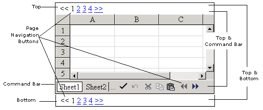
Note that you cannot display the page navigation in all these positions at once, but you can display them at the top and bottom or top and command bar at the same time. The illustration serves to show the possible placements in one diagram.
Numbers: For sheets that consist of many pages, you can set how many page numbers are displayed. If the number of pages for a sheet exceeds the value specified by the PageCount property, an ellipses (...) is displayed. The user clicks the ellipses to display the next (or previous) set of page numbers.
Alignment: You can set the alignment of the navigation aids when they appear in the top or bottom bar or both. When right aligned, for example, the navigation aids appear on the right side of the bar(s). This does not affect the display in the command bar.
Colors: You can set both the background color of the page navigation aids and the text color (foreground color) for display in the top or bottom bar or both. This does not affect the display in the command bar.
Font: You can set the font, when the navigation aids are displayed in the top or bottom bar or both. This does not affect the display in the command bar.
Labels: You can customize the labels of these buttons on the client using the CreateButton event. For more information, refer to Customizing Page Navigation Buttons on the Client.
For more information on setting the size of the page, refer to Customizing the Page Size (Rows to Display).
Using the Properties Window
- Select the FpSpread component.
- Select the Pager object and set properties as needed.
- Select the Sheets collection and set properties such as PageSize and RowCount.
Using Code
- Use the PagerInfo class to set the properties of the Pager property for the FpSpread component.
- Specify what part of the page navigation to display by setting the Mode property of the PagerInfo class with the settings of the PagerMode enumeration.
- Specify where to display the page navigation aids by setting the Position property with the settings of the PagerPosition enumeration and how many page numbers to display by setting the PageCount property.
- Specify the appearance of the page navigation aids by setting the font and color.
Example
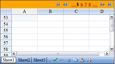
In this example, set the page navigation buttons to appear at the top of the component on a separate tool bar above the sheet (and not on the tool bars below the sheet). Display both the page numbers and the page arrows with the specified font and colors and display them on the right side of that top bar, as shown in the figure.
| C# |  Copy Code Copy Code |
|---|---|
// Set the number of sheets. FpSpread1.Sheets.Count = 5; // Set the number of rows on the first sheet FpSpread1.Sheets[0].RowCount = 136;// Set the number of rows per page in this sheet. FpSpread1.Sheets[0].PageSize = 13; // Display the pager only at the top of the component. FpSpread1.Pager.Position = FarPoint.Web.Spread.PagerPosition.Top; // Display both numbers and arrows by setting mode. // Set the mode after the position, otherwise an error. FpSpread1.Pager.Mode = FarPoint.Web.Spread.PagerMode.Both; // Format the text in the pager at the top. FpSpread1.Pager.Align = HorizontalAlign.Right; FpSpread1.Pager.Font.Bold = true; FpSpread1.Pager.Font.Name = "Trebuchet MS"; FpSpread1.Pager.ForeColor = Color.Brown; FpSpread1.Pager.BackColor = Color.Orange; // Display at most four page numbers at a time. FpSpread1.Pager.PageCount = 4; |
|
| VB | Copy Code |
|---|---|
' Set the number of sheets. FpSpread1.Sheets.Count = 5 ' Set the number of rows on the first sheet. FpSpread1.Sheets(0).RowCount = 136' Set the number of rows per page in this sheet. FpSpread1.Sheets(0).PageSize = 13 ' Display the pager only at the top of the component. FpSpread1.Pager.Position = FarPoint.Web.Spread.PagerPosition.Top ' Display both numbers and arrows by setting mode. ' Set the mode after the position, otherwise an error. FpSpread1.Pager.Mode = FarPoint.Web.Spread.PagerMode.Both ' Format the text in the pager at the top. FpSpread1.Pager.Align = HorizontalAlign.Right FpSpread1.Pager.Font.Bold = True FpSpread1.Pager.Font.Name = "Trebuchet MS" FpSpread1.Pager.ForeColor = Color.Brown FpSpread1.Pager.BackColor = Color.Orange ' Display at most four page numbers at a time. FpSpread1.Pager.PageCount = 4 |
|
Using the Spread Designer
- Select the Settings menu.
- Select the Paging icon under the Spread Settings section.
- Select the various options.
- Click Apply and OK.
- Click Apply and Exit to close the Spread Designer.