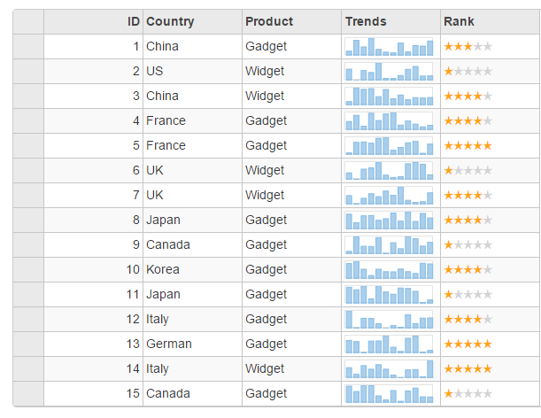
The FlexGrid control provides a powerful and flexible way to display data from a datasource in tabular format. The FlexGrid control is a full-featured grid, providing various features including several selection modes, sorting, column reordering, grouping, filtering, editing, custom cells, XAML-style star-sizing columns, row and column virtualization, etc.
FlexGrid provides design flexibility with unbound columns, conditional formatting and cell level customization. This allows developers to create complex grid-based applications, and edit and update data bound to database.

Key Features
- AllowMerging: Set the AllowMerging to true to enable merging of cells that contain the same content.
- PageSize: Set the value of PageSize property to the number of items you want on each page.
- ChildItemsPath: Set the value of ChildItemsPath property to represent grid in a tree view.
- DisableServerRead: Set the value of DisableServerRead property to True to disable scrolling of grid at server side.
- HeadersVisibility: Set the value of HeadersVisibility to None, All, Column or Row to specify the visibility of header in the grid.
- ImeEnabled: Set the value of ImeEnabled to enable the grid to support InputMethodEditors (IME). This property is valid for sites/applications in Japanese, Chinese, or any other languages that require IME support.
See Also