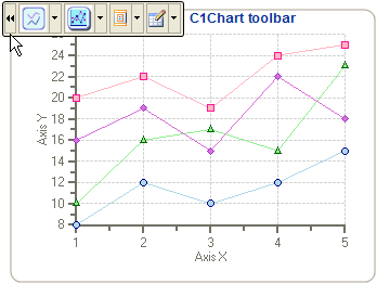
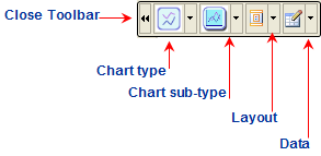
The primary C1Chart floating toolbar for the C1Chart control includes the following command buttons: a Close, Chart type, Chart sub-type, Layout, and a Data button.

Exposing the C1Chart Floating Toolbar
To expose the C1Chart floating toolbar slide your cursor anywhere on the C1Chart control.
C1Chart Toolbar's Command Buttons
The following figure provides a label for each of the command buttons in the C1Chart toolbar.

The following section lists all of the command buttons available in the C1Chart toolbar and describes the functionality of each one.
Close Toolbar button
The close command button ![]() closes the toolbar once it is
clicked.
closes the toolbar once it is
clicked.
Chart type button
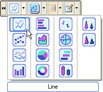
The Chart type command has a drop-down menu that contains a selection of all the chart types provided by the C1Chart control. Mousing over each chart image exposes a label with the name of the selected chart type. You can choose from one of the following simple chart types: Line, X-Y, Step, Column, Bar, Area, Pie, Doughnut, Financial/Stock, Polar/Radar, and Gantt, Cylinder, Cone, and Pyramid.

Chart sub-type button
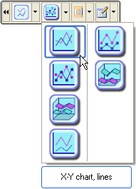
The Chart sub-type command also has a drop-down menu which contains a selection of all the chart sub-types provided by the C1Chart control. Mousing over each chart image exposes a label with the name of the selected chart sub-type. For example, when the Line chart type is selected from the chart-type, the following complex chart sub-types are available: X-Y chart lines, X-Y chart/lines/symbols, X-Y chart/lines/3D, X-Y chart/lines/stacked, X-Y chart/lines/symbols/stacked, X-Y chart/lines/symbols/stacked, and X-Y chart/lines/stacked/3D. There are unique sub-type charts for each chart type.

Layout button
The Layout command button has a drop-down menu which contains the Header, Footer, and Legend elements. Selecting one of the elements exposes either an editable Header, Footer, or Legend element directly on the Chart Area.

Selecting either the Header or Footer element exposes an editable textbox along with a toolbar that provides formatting commands. If the toolbar does not appear instantly then you can click the left mouse button and slide it over the textbox to expose the toolbar. The image below illustrates the Header text box automatically added to the Chart Area of the C1Chart control.
![]()
Data button
The Data button has a drop-down menu which includes
three options for the user to select from: Edit data series, Edit data table,
and Edit data binding. The Edit data series item exposes the Chart
Properties designer for the data series. The Edit data table item exposes
the Chart Properties designer for the data table. The Edit data
binding item exposes the Chart Properties designer for the data
binding. If you would like to edit another element other than the data series,
data table, and data binding you can click on the ![]() button to navigate to a different
chart element in the tree view of the Chart Properties designer.
button to navigate to a different
chart element in the tree view of the Chart Properties designer.

Send comments about this topic to ComponentOne. Copyright © ComponentOne LLC. All rights reserved. |