A Gantt chart is used to illustrate a timeline of various tasks and outline the critical activities to the project's completion.
The Gantt chart has the following similarities to the Bar and the HiLo charts:
· Like the Bar chart, the Gantt chart uses bars, but it is commonly displayed as an inverted and reversed bar chart.
· Similar to the HiLo chart, where the elements of the Y and Y1 arrays in each series represent the "high" value and the "low" value, the Gantt chart uses the Y and Y1 elements to represent the start and finish time of a task.
A Gantt chart clearly illustrates a timeline in the following ways:
· Activities/Tasks
The activities/tasks are displayed along the left side of the chart and a timeline is shown at the top or bottom of the chart.
· Task Duration
The duration of each project's task is represented as a bar. The beginning of the bar indicates the start time of the activity or task. The end of the bar indicates the finish or completion time of the activity or task.
· Critical Activities or Accomplishments
Typically, in Gantt charts, special characters or colors are used to represent critical activities or accomplishments through the duration of each task.
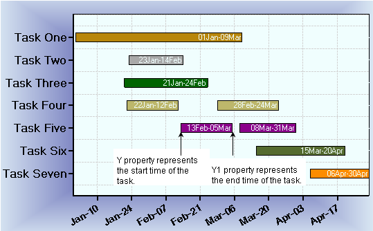
In a Gantt chart you can create a new task by adding a new series to the ChartDataSeries. In each series there are several properties that you will use to create the information for your data in the task. For instance, you can use the Y property to fill in the data for the start time of your task and the Y1 property to record the data for the end time of your task. You can choose the type of data that you want to use for your Gantt chart from the DataType property of the ChartDataArray.
The Gantt chart below shows the start and finish time of each task. Gantt charts can display single or multiple projects in one task. In some cases, a task is assigned multiple subtasks. Each bar represents one task or subtask. Having a few bars in one axis can span a large range of x and y values. The data for a Gantt chart is more effective when it is displayed horizontally rather than vertically. As a result, the chart is inverted when the x-axis is vertical and the y axes are horizontal. C1Chart provides the Inverted property of the ChartArea and the Reversed property of the Axis. Notice that each horizontal bar is filled in with a solid color. Often, this represents a completed task. Also, each horizontal bar contains a label indicating the start date and finish date. The labels can be added to the horizontal bars at run time or at design time by using the Label property of the ChartDataSeries class.
To set the chart type to Gantt at design time
· Expand the ChartGroups node in the Properties window. Open the ChartGroups Collection Editor by clicking the ellipsis button. In the right pane of the editor, set the ChartType property to Gantt.
· An alternate method to change chart type is to right-click the existing chart and select Chart Properties. From the Gallery, select ChartType as Gantt.
· Another alternate method is to select Chart Properties from the Properties pane. From the Gallery, select ChartType as Gantt.
 Gantt Chart Programming Considerations
Send comments about this topic to ComponentOne. Copyright © ComponentOne LLC. All rights reserved. |