A Histogram chart's appearance is similar to a bar chart. A minor difference in appearance is that the rectangles in a bar chart are commonly separated by a space, whereas the rectangles in a histogram are not separated by a space. Histogram's columns are not separated because the column boundaries represent the actual X axis values bounding the interval represented by each column.
While the histogram and bar charts' appearances relate, their functionality does not. A bar chart is created from data points whereas a Histogram is created from the frequency distribution of the data.
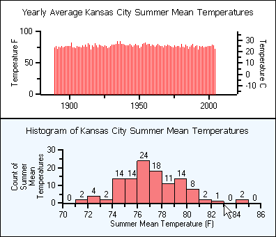
The charts following illustrate the difference between a bar chart and a histogram chart. Both of the charts use exactly the same Y data. The bar chart (top) shows each average mean temperature for each year in which it occurred. The histogram chart (bottom) using the same input temperature data automatically tabulates the number of temperatures that fall within each interval and draws the resulting histogram. For convenience, chart labels with the count in each interval have been added at the top of each interval.
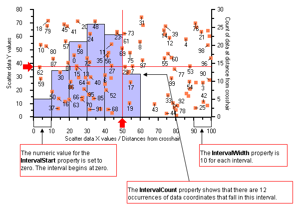
The chart below shows the details and properties of a histogram. It is a scatter chart of one hundred random data coordinates in one ChartGroup, and in the second ChartGroup, a histogram based on the distribution of distances from each scatter data point to the intersection of the markers.
In the histogram chart above, the SemiAutomatic method is used for the IntervalCreationMethod property to specify the upper and lower limits together with the number of intervals. The IntervalCreationMethod property is useful when you need to set different interval boundaries.
You can choose one of the following three methods from the IntervalCreationMethod property:
· SemiAutomatic
When the SemiAutomatic method is used, the upper and lower limits of the intervals are specified together with the number of intervals. Interval boundaries are calculated uniformly. The IntervalStart, IntervalWidth, and IntervalNumber properties are available when you select the SemiAutomatic method. The IntervalStart property gets or sets the numeric value of the beginning of the first interval. In the histogram chart above, the IntervalStart property is set to zero, therefore the interval begins at the value, zero. You can specify the interval width by setting the IntervalWidth property to a specific width size. In the example above, the IntervalWidth property gets the width size of 10 for each interval. The IntervalNumber property will get the number of intervals in a histogram. For example, in the histogram chart above the IntervalNumber property is set to 10, therefore, there can be a maximum of ten intervals. The remaining four intervals are not displayed in the chart above, since they have zero data elements.
· Automatic
When the Automatic method is used, the chart calculates the upper and lower limits of the intervals using the maximum and minimum data values, and restricting the intervals to lie within 3 standard deviations of the data mean. The number of intervals is optional. Interval boundaries are calculated uniformly.
· XDataBoundaries
When the XDataBoundaries method is used, the X values of the data series are used to explicitly set each interval boundary. The X values are sorted and duplicate values are eliminated. Each ascending value of the result is used determine the next interval boundary. Thus, the first and second resulting X values define the first interval and each successive X value specifies the end of the next interval. Note that specification of N intervals requires N+1 unique X values.
To access the IntervalCreationMethod property at design time, expand the ChartData node and click the ellipsis button next to the SeriesList node. The ChartDataSeries Collection Editor will appear. Locate the Histogram node and expand it. Select the IntervalCreationMethod property and choose the type of method by selecting from one of the three methods in the IntervalCreationMethod property's drop-down box. The IntervalCreationMethod property can also be accessed through code by entering the following:
cds.Histogram.IntervalCreationMethod = IntervalMethodEnum.SemiAutomatic
· C#
cds.Histogram.IntervalCreationMethod = IntervalMethodEnum.SemiAutomatic;
· Delphi
cds.Histogram.IntervalCreationMethod := IntervalMethodEnum.SemiAutomatic;
Note that the text, "cds," shown above, is the variable name for the ChartDataSeries object. In the code example above, the SemiAutomatic method is used. You could also you the Automatic or XdataBoundaries method by assigning either one to the IntervalMethodEnum.
You can display the intervals and counts as a Histogram, Frequency, or a Stepped Frequency by using the DisplayType property of the ChartHistogram object as shown in the following example:
'Displays the chart histogram as a Histogram
ch.DisplayType = DisplayTypeEnum.Histogram
'Displays the chart histogram as a frequency graph
ch.DisplayType = DisplayTypeEnum.FrequencyGraph
'Displays the chart histogram as a stepped frequency graph
ch.DisplayType = DisplayTypeEnum.SteppedFrequencyGraph
· C#
//Displays the chart histogram as a Histogram
ch.DisplayType = DisplayTypeEnum.Histogram;
//Displays the chart histogram as a frequency graph
ch.DisplayType = DisplayTypeEnum.FrequencyGraph;
//Displays the chart histogram as a stepped frequency graph
ch.DisplayType = DisplayTypeEnum.SteppedFrequencyGraph;
· Delphi
//Displays the chart histogram as a Histogram
ch.DisplayType := DisplayTypeEnum.Histogram;
//Displays the chart histogram as a frequency graph
ch.DisplayType := DisplayTypeEnum.FrequencyGraph;
//Displays the chart histogram as a stepped frequency graph
ch.DisplayType := DisplayTypeEnum.SteppedFrequencyGraph;
Note: The text, "ch," in the above example, is the variable name for the ChartHistogram object.
Sometimes a few data elements appear far from the rest of the data elements. In this circumstance, the distant value is referred to an outlier value. In most cases, the outlier will not fall into an interval since it's so far from the rest of the data, therefore, the value of the data element will be missed.
To prevent outlier values from exclusion, C1Chart's ChartHistogram object provides the following two properties:
The AboveIntervalCount returns the number of values greater then the ending value of the last interval.
The BelowIntervalCount returns the number of values numerically less than the starting value of the first interval.
In the designer you can find the AboveIntervalCount and BelowIntervalCount properties located in the Histogram node of the ChartDataSeries Collection Editor. The following code shows how to use the AboveIntervalCount property to see if there are any outlier values:
Dim overflow As Integer =
_
CInt(cds.Histogram.AboveIntervalCount)
Dim msg As String = ""
' this tests to see if there are any outlier values that fall after the last interval.
If overflow > 0 Then
msg = "Number > " + carea.AxisX.Max.ToString() + " = " + overflow.ToString()
End If
c1Chart1.ChartLabels("overflow").Text = msg
· C#
int overflow =
(int)cds.Histogram.AboveIntervalCount;
string msg = "";
// this
tests to see if there are any outlier values that fall
after
the last interval.
if(overflow > 0)
{
msg = "Number > " + carea.AxisX.Max.ToString() + " = " + overflow.ToString();
}
c1Chart1.ChartLabels["overflow"].Text = msg;
· Delphi
overflow :=
(Integer(cds.Histogram.AboveIntervalCount));
msg := '';
// this tests to see if there are any outlier values that fall after the last interval.
if (overflow > 0) then
msg := ((('Number > ' + carea.AxisX.Max.ToString) + ' = ') + overflow.ToString);
c1Chart1.ChartLabels['overflow'].Text := msg;
end;
In histograms the area of a column or interval is proportional to the value it represents. When the interval width is the same for all intervals then each interval height represents the same frequency per unit width. In some cases the widths of the columns vary in size. When this occurs, the height of the columns must be adjusted to keep the areas proportional. For example, if you had a few columns that were non-uniform you could utilize the Normalized property in C1Chart's Histogram object to make the column or interval proportional to the value it represents.
The histogram object contains three properties: NormalDisplay, NormalizationInterval, and Normalized. The Normalized property can be used when you want non-uniform intervals to be normalized so each interval height represents the same frequency per unit width. A non-uniform interval is an interval that is not in uniform with the remaining intervals. When you set the Normalized property to True you have the flexibility of setting the NormalizationInterval property to a specific width size. Let's say that your IntervalWidth is 10 and you want to normalize it to 20. This will cause the size of each interval to double. As a result it will cause each frequency count (y-value) to double. If you wanted to normalize your IntervalWidth to 2 from 10 so you can normalize the interval width 1/5 of the size then this would make each frequency count (y-value) 1/5 smaller.
Send comments about this topic to ComponentOne. Copyright © ComponentOne LLC. All rights reserved. |