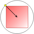
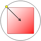
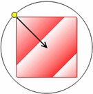
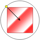
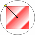
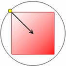
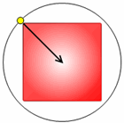
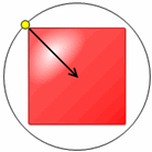
You can customize the chart element's appearance even more by using applying angle, gradient, intensity, scaling, and shape to change the effects of the light source.
You can change the angle of the visual rendering by setting its Angle property to a different degree. The default value for the Angle is 45 degrees. The value of the Angle property ranges from -180 to 180 degrees. As you change the value of the Angle the arrow points to the color and it move around the square in counter-clockwise direction.
You can also apply a light gradient to the chart element using the Gradient property. The default setting is Simple. The Gradient has three different settings: Simple, SigmeBell, and Triangle. When you select SigmeBell or Triangle for the light Gradient a Focus property appears. The default value for the Focus property is 0.1. As you increase the Focus, the light gradually moves in opposite direction from the previous position. For example, when the Focus property changes from 0 to 1 the light position moves in an opposite direction for the SigmeBell or Triangle gradient.
The following table illustrates the transition from the light position when Focus is zero and when Focus is 1.
|
Focus = 0 |
Focus = 1 |
|
|
|
When the Light intensity is set to 0, the Gradient effects are not noticeable. The light gradient effects become more distinguishable when you increase the light intensity. The default value for the Intensity is 0.9.
You can show repetitive light patterns in a chart element by setting the Scale property to a value less than 1. As you decrease the Scale, the light pattern repeats more. The values of the Scale property range from 0 to 1.
Note: The Scale property is only applicable for the Rectangle light shape.
The following table shows the effect of the different light gradients when the Intensity property is 1 and the Scale property is 0.4.
|
Light Gradient |
Image |
|
Simple |
|
|
SigmeBell |
|
|
Triangle |
|
You can change the shape of the light to rectangle, ellipse, or edge by using the Shape property in the Visual Effects designer. The default shape is a rectangle.
When you set the light shape to Edge, the Gradient and Scale properties are not available since these properties do not visually affect the edge light shape. When you select the Ellipse shape, two more properties, Shift and Size are added for further customization. You can shift the ellipse light shape across the element by sliding the Shift slider. You can also increase the size of the ellipse light shape by moving the Size slider from left to right.
The following table illustrates how the rectangle, ellipse, and edge shape appear for the chart element.
|
Rectangle |
Ellipse |
Edge |
|
|
|
|
For more information on applying light effects to a specific chart element, see Add a Light Pattern, Add a Light Shape, or Adjust the Focus of the Light.
Send comments about this topic to ComponentOne. Copyright © ComponentOne LLC. All rights reserved. |
