Use the HorizontalAlignment property of the columns Style object to control the horizontal placement of cell text within a column. The allowable values for this property are as follows:
The setting AlignHorzEnum.General, which is the default for data cells, indicates that the alignment should be based upon the underlying data type. For example, strings are left-aligned, while numbers are right-aligned.
Use the VerticalAlignment member of the Style object to control the vertical placement of text within the cells of a grid, split, or column. The allowable values for this property are as follows:
For data cells, the default value is AlignVertEnum.Top. For static grid elements such as caption bars, column headers, and column footers, the default value is AlignVertEnum.Center. See the Named Style Defaults topic to learn how the default values are derived.
The following grid depicts all possible combinations of the HorizontalAlignment and VerticalAlignment properties.
|
|
AlignHorzEnum.Near |
AlignHorzEnum.Center |
AlignHorzEnum.Far |
|
AlignVertEnum.Top |
|
|
|
|
AlignVertEnum.Center |
|
|
|
|
AlignVertEnum.Bottom |
|
|
|
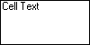
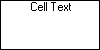
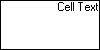
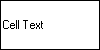
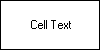
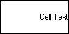
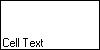
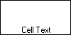
The AlignHorzEnum.General and AlignHorzEnum.Justify settings have been omitted because the AlignHorzEnum.General setting aligns text as AlignHorzEnum.Near and numeric values as AlignHorizEnum.Far. The AlignHorzEnum.Justify setting aligns text with respect to the cells boundries, but in this case appears exactly like the AlignHorzEnum.Near setting.
The HorizontalAlignment and VerticalAlignment properties are tightly integrated with the concept of styles. For more information, see How to Use Styles.
|
Send comments about this topic to ComponentOne. Copyright © ComponentOne LLC. All rights reserved. |