True DBGrid for .NET supports a standard, "flat" control appearance, the more attractive three-dimensional appearance used by many controls, and a third that combines the flat appearance with the 3D. By default, the grid's FlatStyle property is set to FlatModeEnum.Standard so that the 3-D look is used. However, this property only controls whether 3D effects are used to draw the grid's border, caption bars, column headings and footings, and the record selector column. It does not affect the grid's data cells or row and column dividers.
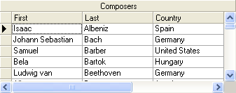
When FlatStyle is set to FlatModeEnum.Standard, the grid looks like this.
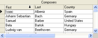
When FlatStyle is set to FlatModeEnum.PopUp, the grid looks like this.
Note that the initial grid has the same in appearance as FlatModeEnum.Flat. As the mouse moves over any control element, the appearance of that element takes on a 3D look.
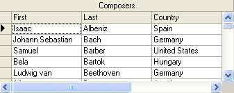
When FlatStyle is set to FlatModeEnum.Flat, the grid looks like this.
To achieve a 3D appearance for the entire grid, including its interior, set the following properties either in the designer or in code:
In the Properties window, set the RowDivider style property to Raised. Or, in code:
Me.C1TrueDBGrid1.RowDivider.Style = C1.Win.C1TrueDBGrid.LineStyleEnum.Raised
· C#
this.c1TrueDBGrid1.RowDivider.Style = C1.Win.C1TrueDBGrid.LineStyleEnum.Raised;
· Delphi
Self.C1TrueDBGrid1.RowDivider.Style := C1.Win.C1TrueDBGrid.LineStyleEnum.Raised;
In the Splits Collection editor, set the Style property to LineStyleEnum.Raised for all ColumnDivider style objects for each split. Or, in code:
Dim C As C1.Win.C1TrueDBGrid.C1DisplayColumn
For Each C In Me.C1TrueDBGrid1.Splits(0).DisplayColumns
C.ColumnDivider.Style = C1.Win.C1TrueDBGrid.LineStyleEnum.Inset
Next
· C#
C1.Win.C1trueDBGrid.C1DisplayColumn C ;
for each(C in this.C1trueDBGrid1.Splits[0].DisplayColumns)
{
C.ColumnDivider.Style = C1.Win.C1TrueDBGrid.LineStyleEnum.Raised;
}
· Delphi
var
i: Integer;
C: C1TrueDBGrid.C1DisplayColumn;
begin
for i := 0 to Self.C1TrueDBGrid1.Splits[0].DisplayColumns.Count-1 do
begin
C := Self.C1TrueDBGrid1.Splits[0].DisplayColumns[i];
C.ColumnDivider.Style := C1.Win.C1TrueDBGrid.LineStyleEnum.Rasied;
end;
end;
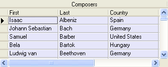
In the Properties window, set the BackColor property of the Normal style to Lavender. Or, in code:
Me.C1TrueDBGrid1.Styles("Normal").BackColor = System.Drawing.Color.Lavender
· C#
this.c1TrueDBGrid1.Styles["Normal"].BackColor = System.Drawing.Color.Lavender;
· Delphi
Self.C1TrueDBGrid1.Styles['Normal'].BackColor := System.Drawing.Color.Lavender;
The resulting grid will look something like this.
Note that changing the Style property of the RowDivider object to Raised consumes an extra vertical pixel in each data row, resulting in fewer visible rows.
Try experimenting with other color combinations and divider styles to achieve different 3D effects, as explained in the Borders and Dividing Lines section.
|
Send comments about this topic to ComponentOne. Copyright © ComponentOne LLC. All rights reserved. |