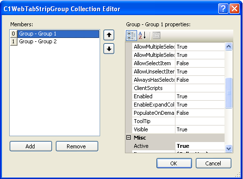
The picture below represents the collection of properties for C1WebTabStripGroup Collection Editor. The C1WebTabStripGroup Collection Editor allows the user to view and modify groups. Note that when the group is selected for modification, the group's name appears above the group's properties.
The following properties are available below for the user in the C1WebTabStripGroup Collection Editor:
C1WebTabStripGroup Properties
· C1WebTabStripGroup Appearance
Properties 
The appearance properties change the appearance of the group. Below are the appearance properties and their functions:
|
Property |
Description |
|
CaptionImageHeight |
Gets or sets the height of the image set in the CaptionImageUrl property of the header styles. |
|
CaptionImageWidth |
Gets or sets the width of the image set in the CaptionImageUrl property of the C1WebGroupHeader styles. |
|
GroupPadding |
Default space between the group's border and items in the group. |
|
IconBarWidth |
Sets or returns the width of the icon bar drawn on the side of the groups. |
|
ItemPadding |
Gets or sets the default space between the item's border and content. |
|
ItemSpacing |
Gets or sets the space between the items in the group. |
|
Text |
Gets or sets the text that is displayed in the group header. |
|
TextHeight |
Gets or sets the height of C1WebGroupHeader's text. |
|
WrapText |
Gets or sets a value that indicates whether the item's text is wrapped. |
· C1WebTabStripGroup Behavior Properties
The behavior properties change the behavior of the group. Below are the behavior properties and their functions:
|
Property |
Description |
|
AllowMultipleSelect |
If False, only a single item can be selected in the group. |
|
AllowMultipleSelectInControl |
If False, only a single item can be selected in the all of the groups in the control. |
|
AllowSelectItem |
If true, one or more items in the group can be selected. |
|
AllowUnselectItem |
If True, user can unselect the item by clicking it the second time. |
|
AlwaysHasSelected |
If True and if AllowSelectItem=True at minimum one item in the group is selected. |
|
Enabled |
Gets or sets a value indicating whether the group is enabled. |
|
EnableExpandCollapse |
Gets or sets a value indicating whether a user can expand or collapse the group by double-clicking on the header or clicking on the indicator image. |
|
PopulateOnDemand |
Gets or sets a value that indicates whether the group is populated dynamically. |
|
ToolTip |
Gets or sets the ToolTip text displayed when the mouse pointer rests over the group. |
|
Visible |
Gets or sets a value indicating whether the group is visible or not. |
· C1WebTabStripGroup Misc Properties
The miscellaneous property and its function are listed below:
|
Property |
Description |
|
Active |
Determines whether or not the tab is active. |
|
Items |
Collection of the child items. |
· C1WebTabStripGroup Style Properties
The style properties change the group's style. The style properties and their functions are listed below:
|
Property |
Description |
|
ActiveHeaderStyle |
Default style for the tab headers in the active state. |
|
DisabledGroupStyle |
Style for the disabled groups. |
|
DisabledItemStyle |
Style for the child items in the disabled state. |
|
GroupStyle |
Style for the group. |
|
InactiveHeaderStyle |
Default style for the tab headers in the inactive state. |
|
ItemStyle |
Style for the child items in the normal state.. |
|
MouseOverActiveHeaderStyle |
Default style for the tab headers in the active state when the mouse hovers over them. |
|
MouseOverInactiveHeaderStyle |
Default style for the tab headers in the inactive state when the mouse hovers over them. |
|
MouseOverItemStyle |
Style for the child items when the mouse hovers over it. |
|
MouseOverSelectedItemStyle |
Style for the child items when the mouse hovers over the selected item. |
|
SelectedItemStyle |
Style for the child items in the selected state. |
|
SeparatorStyle |
Default style for the separators. |
Send comments about this topic to ComponentOne. Copyright © ComponentOne LLC. All rights reserved. |