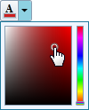
The C1SplitButton control combined a button and a drop-down content area, similar to a standard SplitButton. The C1SplitButton is more dynamic in the type of content that can be included. In the following image, the C1SplitButton's header includes a color picker icon that changes when a color is picked and the C1SplitButton's content area includes a color picker:
You can add content to neither, either, or both the header and content areas. You can customize the C1SplitButton control in XAML by adding content to the header and content areas. For example the following markup creates a drop-down control similar to the one pictured above:
<c1:C1SplitButton x:Name="btn" DropDownWidth="100" DropDownHeight="100" HorizontalAlignment="Left" Click="btn_Click">
<c1:C1DropDown.Header>
<StackPanel>
<TextBlock FontFamily="Times New Roman" FontSize="12" Text="A" FontWeight="Bold" VerticalAlignment="Top" Margin="3 0 0 -2" />
<Border x:Name="selectedColorBorder" Background="Red">
<Border.Style>
<Style TargetType="Border">
<Setter Property="BorderThickness" Value="1" />
<Setter Property="BorderBrush" Value="#FF9E9DA7" />
<Setter Property="Width" Value="14" />
<Setter Property="Height" Value="5" />
<Setter Property="VerticalAlignment" Value="Bottom" />
<Setter Property="Margin" Value="1,0,0,1" />
</Style>
</Border.Style>
</Border>
</StackPanel>
</c1:C1DropDown.Header>
<Border BorderThickness="1" BorderBrush="#FF207A9C" Background="#FFEFF5FF">
<Border.Resources>
<c1:ColorConverter x:Key="colorConverter" />
</Border.Resources>
<c1:C1SpectrumColorPicker ShowAlphaChannel="False" Margin="4" Color="{Binding Background, ElementName=selectedColorBorder, Mode=TwoWay, Converter={StaticResource colorConverter}}" />
</Border>
</c1:C1SplitButton>
Note that the <c1:C1DropDown.Header> defines the header element and the content element is contained within the <c1:C1SplitButton></c1:C1SplitButton> tags.