C1Expander Themes
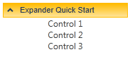
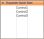
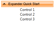
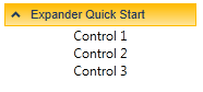
ComponentOne Expander for WPF incorporates several themes that allow you to customize the appearance of your grid. When you first add a C1Expander control to the page, it appears similar to the following image:
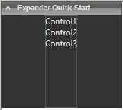
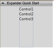
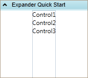
This is the control's default appearance. You can change this appearance by using one of the built-in themes or by creating your own custom theme. All of the built-in themes are based on WPF Toolkit themes. The built-in themes are described and pictured below; note that in the images below, a row has been selected to show selected styles:
Theme Name | Theme Preview |
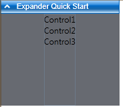
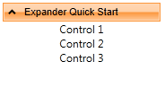
C1ThemeBureauBlack |
|
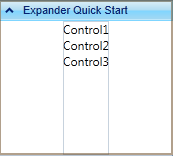
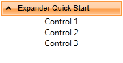
C1ThemeExpressionDark |
|
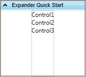
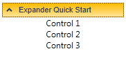
C1ThemeExpressionLight |
|
C1Blue |
|
C1ThemeOffice2007Blue |
|
C1ThemeOffice2007Black |
|
C1ThemeOffice2007Silver |
|
C1ThemeOffice2010Blue |
|
C1ThemeOffice2010Black |
|
C1ThemeOffice2010Silver |
|
C1ThemeShinyBlue |
|
C1ThemeWhistlerBlue |
|
To set an element's theme, use the ApplyTheme method. First add a reference to the theme assembly to your project, and then set the theme in code, like this:
Private Sub Window_Loaded(sender As System.Object, e As System.Windows.RoutedEventArgs) Handles MyBase.Loaded
Dim theme As New C1ThemeExpressionDark
' Using ApplyTheme
C1Theme.ApplyTheme(LayoutRoot, theme)
•C#
private void Window_Loaded(object sender, RoutedEventArgs e)
{
C1ThemeExpressionDark theme = new C1ThemeExpressionDark();
//Using ApplyTheme
C1Theme.ApplyTheme(LayoutRoot, theme);
}
To apply a theme to the entire application, use the System.Windows.ResourceDictionary.MergedDictionaries property. First add a reference to the theme assembly to your project, and then set the theme in code, like this:
Private Sub Window_Loaded(sender As System.Object, e As System.Windows.RoutedEventArgs) Handles MyBase.Loaded
Dim theme As New C1ThemeExpressionDark
' Using Merged Dictionaries
Application.Current.Resources.MergedDictionaries.Add(C1Theme.GetCurrentThemeResources(theme))
End Sub
•C#
private void Window_Loaded(object sender, RoutedEventArgs e)
{
C1ThemeExpressionDark theme = new C1ThemeExpressionDark();
//Using Merged Dictionaries Application.Current.Resources.MergedDictionaries.Add(C1Theme.GetCurrentThemeResources(theme));
}
Note that this method works only when you apply a theme for the first time. If you want to switch to another ComponentOne theme, first remove the previous theme from Application.Current.Resources.MergedDictionaries.