The C1CoverFlow is an animated, three-dimensional user interface. It is an Items control and, as such, can hold text, images, and controls.
Users can browse through the C1CoverFlow control by selecting an item in the list. When a user touches an item on the list, that item will take focus by sliding into the center of the control, which will also cause other items to come into view.
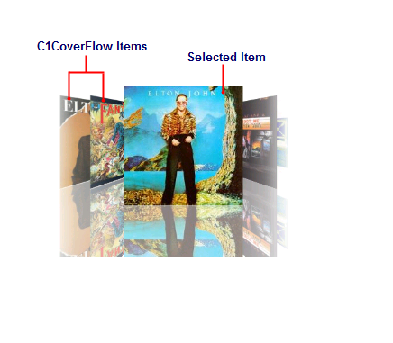
The following image diagrams the elements of the C1CoverFlow control:
•CoverFlow Items
The CoverFlow items can be anything from text to images to controls. Creating a CoverFlow item is simple: Just add a C1CoverFlowItem to the C1CoverFlow control.
•Selected Item
The selected item always appears at the center of the control. Users can select items by clicking on them. You can change the selected item by setting the SelectedIndex property.
The following topics provide an overview of several of the C1CoverFlow control's features.