Using the C1FlexGridGroupPanel control is very easy. Simply add the control to the form, above a C1FlexGrid control, and set its FlexGrid property so it references the C1FlexGrid used to show the data. For example:
<Grid>
  <Grid.RowDefinitions>
    <RowDefinition Height="Auto" />
    <RowDefinition />
  </Grid.RowDefinitions>

  <c1:C1FlexGridGroupPanel
    Background="WhiteSmoke"
    FlexGrid="{Binding ElementName=_flex}"/>

  <c1:C1FlexGrid x:Name="_flex" Grid.Row="1" />
</Grid>
The XAML is very simple. The C1FlexGridGroupPanel doesn't have to be styled, because it picks up the required attributes from the controlling C1FlexGrid. If you change the background, foreground, or font of the column headers on the grid, the C1FlexGridGroupPanel will automatically use those elements to render the group markers so they look like column headers.
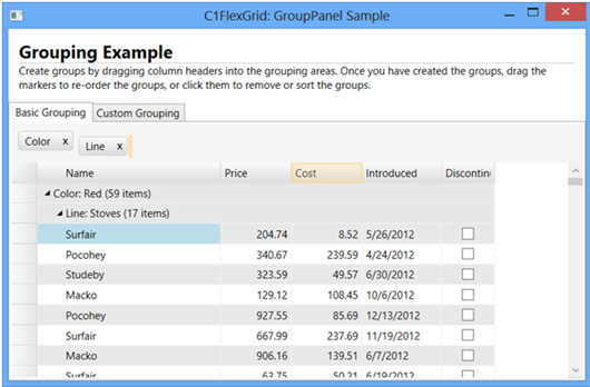
This XAML will produce the following result:
The image shows a C1FlexGrid with product data grouped by "Color" and "Line". The groups were created by dragging the grid columns onto the grouping area.
In the image, the "Cost" column is highlighted because it is also being dragged onto the grouping area. The orange cursor to the right of the "Line" group marker indicates the position where the new group will be inserted.
The color of the drag markers (orange in the image) can be changed by setting the DragMarkerColor property.
Once a group is created, the corresponding column is hidden by default. This is an optional feature that can be turned off by setting the HideGroupedColumns property to false.
The group markers can be clicked to sort the data in ascending or descending order. Pressing the control key and clicking the group headers removes the sort. This is the same behavior as the C1FlexGrid.
The group markers can also be dragged within the grouping area to re-arrange the groups or back into the grid to remove the group and restore the column at any position. Finally, the group markers have close buttons (marked by an "x") that can be clicked to remove the group.
The C1FlexGridGroupPanel manages groups using the ICollectionView interface of the collection used as the grid's data source. All changes made to the groups are visible to other controls bound to the same ICollectionView. Note that this means the grouping feature cannot be used in unbound scenarios.
When the C1FlexGridGroupPanel creates a new group, it fires a PropertyGroupCreated event that allows the application to customize the new groups. This is typically used to assign custom converters to the newly created groups. For example:
/// <summary>
/// Customize group descriptors created by the C1FlexGridGroupPanel.
/// </summary>
void _groupPanel_PropertyGroupCreated(object sender, PropertyGroupCreatedEventArgs e)
{
  var pgd = e.PropertyGroupDescription;
  switch (pgd.PropertyName)
  {
    case "Introduced":
      pgd.Converter = new DateTimeGroupConverter();
      break;
    case "Price":
      pgd.Converter = new AmountGroupConverter(1000);
      break;
    case "Cost":
      pgd.Converter = new AmountGroupConverter(300);
      break;
  }
}
This code handles the PropertyGroupCreated event and assigns custom converters to different columns in the data source. In this case, the DateTimeGroupConverter and AmountGroupConverter classes are simple converters used to group DateTime and double values into ranges.
The image below shows the effect achieved with custom grouping:
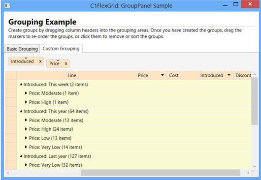
Notice that items may appear in multiple groups. For example, the DateTimeGroupConverter groups dates into "This week", "This year", "Last year", and "Before Last year". Items in the "This week" group are also included in the "This year" group.
This is a feature of the ICollectionView interface, not particular to the C1FlexGrid or C1FlexGridGroupPanel controls.