Data Labels and Tooltips
Data labels (also called data marker labels) are labels associated with data points. They can be useful on some charts by making it easier to see which series a particular point belongs to, or its exact value.
C1Chart supports data labels. Each data series has a PointLabelTemplateproperty that specifies the visual element that should be displayed next to each point. The PointLabelTemplate is usually defined as a XAML resource, and may be assigned to the chart from XAML or from code.
Going back to our previous example, let us add a simple label to each of the three data series. The first step would be to define the template as a resource in the MainPage.xaml file:
<UserControl x:Class="ChartIntro.MainPage"
xmlns="http://schemas.microsoft.com/winfx/2006/xaml/presentation"
xmlns:x="http://schemas.microsoft.com/winfx/2006/xaml"
xmlns:c1chart="clr-namespace:C1.Silverlight.Chart;assembly=C1.Silverlight.Chart">
<!-- DataTemplate for chart labels -->
<UserControl.Resources>
<DataTemplate x:Key="chartLabel">
<Border
c1chart:PlotElement.LabelAlignment="MiddleCenter"
Opacity="0.5" Background="White" CornerRadius="20"
BorderBrush="Black" BorderThickness="2" Padding="4">
<TextBlock
Text="{Binding Value}"
Foreground="Black" FontSize="16"/>
</Border>
</DataTemplate>
</UserControl.Resources>
<!-- Main grid -->
<Grid x:Name="LayoutRoot" Background="White" Margin="10" >
<!—no changes here -->
</Grid>
</UserControl>
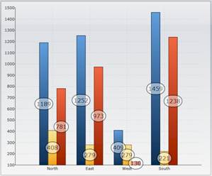
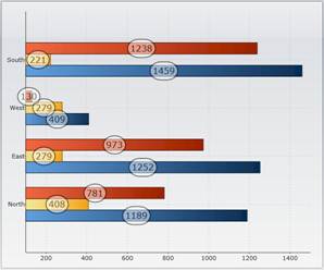
This resource defines how to obtain a data label for each point. Note that the template contains a TextBlock element with the Text property set to "{Binding Value}". This causes the text to be bound to the value of the associated data point. Also note that the LabelAlignment property is used to determine where the label should be positioned relative to the data point on the chart.
In order to use the new template, we need to modify the code in the MainPage.xaml.cs file as follows:
// Get the data
var data = GetSalesPerRegionData();
_c1Chart.Data.ItemsSource = data;
// Show regions along label axis
_c1Chart.Data.ItemNameBinding = new Binding("Region");
// Add data series
foreach (string series in "Revenue,Expense,Profit".Split(','))
{
var ds = new DataSeries();
ds.Label = series;
ds.ValueBinding = new Binding(series);
ds.PointLabelTemplate = Resources["chartLabel"] as DataTemplate;
_c1Chart.Data.Children.Add(ds);
}
The only change is one extra line of code that sets the PointLabelTemplate property to the resource defined in XAML.
Here is what the chart looks like after adding the labels:
|
|
You are not limited to showing a single value in each data label. C1Chart provides a DataPointConverter class that you can use to create more sophisticated bindings for your label templates. The converter is declared and used as a resource, along with the template.
For example, here is a revised version of the resource in the XAML file:
<UserControl x:Class="ChartIntro.MainPage"
xmlns="http://schemas.microsoft.com/winfx/2006/xaml/presentation"
xmlns:x="http://schemas.microsoft.com/winfx/2006/xaml"
xmlns:c1chart="clr-namespace:C1.Silverlight.Chart;assembly=C1.Silverlight.Chart">
<!-- DataTemplate for chart labels -->
<UserControl.Resources>
<c1chart:DataPointConverter x:Key="dataPointConverter" />
<DataTemplate x:Key="chartLabel">
<Border
c1chart:PlotElement.LabelAlignment="MiddleCenter"
Opacity="0.5" Background="White" CornerRadius="20"
BorderBrush="Black" BorderThickness="2" Padding="4">
<TextBlock
Text="{Binding
Converter={StaticResource dataPointConverter},
ConverterParameter='{#SeriesLabel}{#NewLine}{#Value:$#,##0.00}'}"
Foreground="Black" FontSize="16"/>
</Border>
</DataTemplate>
</UserControl.Resources>
<!-- Main grid -->
<Grid x:Name="LayoutRoot" Background="White" Margin="10" >
<!—no changes here -->
</Grid>
</UserControl>
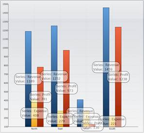
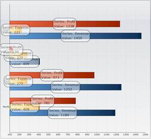
Notice the change in the binding for the Text property. This version specifies the converter and a converter parameter. The parameter is a string that contains keywords that will be replaced with data from the point that the label is bound to. The sample uses the #SeriesLabel, #NewLine, and #Value keywords. Other valid keywords are #YValue, #PointIndex, and #SeriesIndex.
The parameter also supports the usual .NET formatting syntax. The sample formats values as currencies with a currency symbol, thousand separators, and two decimals.
This is what the chart looks like after changing the template:
|
|