Zooming and Panning with Two Charts
Good examples of zooming and panning charts can be found in the "Google Financial" site and in the "Stock Portfolio" sample included with the ComponentOne Studio for Silverlight. Both applications show two charts. The bottom chart displays all the data available, and includes a range selector that allows users to pick the range they are interested in. The top chart displays data for the selected range only, allowing users to zero-in on interesting parts of the chart.
To implement this type of application using C1Chart, you would add two charts and a range slider to the page (or to a user control). For example:
<UserControl x:Class="ChartIntro.ZoomChart"
xmlns="http://schemas.microsoft.com/winfx/2006/xaml/presentation"
xmlns:x="http://schemas.microsoft.com/winfx/2006/xaml"
xmlns:c1="clr-namespace:C1.Silverlight;assembly=C1.Silverlight"
xmlns:c1chart="clr-namespace:C1.Silverlight.Chart;assembly=C1.Silverlight.Chart"
Loaded="ZoomChart_Loaded" >
<Grid x:Name="LayoutRoot" Background="White">
<Grid.RowDefinitions>
<RowDefinition Height="4*" />
<RowDefinition Height="*" />
</Grid.RowDefinitions>
<!-- Main chart (shows selected range) -->
<c1chart:C1Chart x:Name="_c1MainChart" />
<!-- Zoom chart (shows entire data range) -->
<c1chart:C1Chart x:Name="_c1ZoomChart" Grid.Row="1" />
<!-- Range slider (selects a range from the zoom chart) -->
<c1:C1RangeSlider x:Name="_slider" Grid.Row="1" VerticalAlignment="Bottom"
Minimum="0" Maximum="1" ValueChange="0.1"
LowerValueChanged="_slider_ValueChanged"
UpperValueChanged="_slider_ValueChanged" />
</Grid>
</UserControl>
The XAML creates the controls and specifies two event handlers. The first event handler, ZoomChart_Loaded, is invoked when the page loads, and is responsible for initializing the charts:
// Draw main and zoom charts when the control loads
void ZoomChart_Loaded(object sender, RoutedEventArgs e)
{
DrawChart(_c1MainChart);
DrawChart(_c1ZoomChart);
}
// Draw a chart with some random data
void DrawChart(C1Chart chart)
{
chart.Theme = ChartTheme.DuskGreen;
chart.ChartType = ChartType.LineSymbols;
var ds = new DataSeries();
ds.ValuesSource = CreateData(100);
chart.Data.Children.Add(ds);
}
// Create some random data for the chart
double[] CreateData(int cnt)
{
var rnd = new Random(0);
double[] data = new double[cnt];
int last = 0;
for (int i = 0; i < data.Length; i++)
{
int next = rnd.Next(0, 50);
data[i] = last + next;
last = next;
}
return data;
}
The code is similar to the one used in the first sections, when we introduced the basic C1Chart concepts. The routine that creates the chart is called twice, once to create the main chart above and once to create the zoom chart below it.
The next event handler is called when the user modifies the range using the range slider control. The event handler is responsible for updating the range displayed by the main chart:
// Update visible range in main chart when the slider changes
private void _slider_ValueChanged(object sender, EventArgs e)
{
if (_c1MainChart != null)
{
Axis ax = _c1MainChart.View.AxisX;
ax.Scale = _slider.UpperValue - _slider.LowerValue;
ax.Value = _slider.LowerValue / (1 - ax.Scale);
}
}
The event handler uses the Scale and Axis.Value properties to display the range selected by the user.
The Scale property determines how much data is shown on the chart. When Scale = 1, all data available is displayed; when Scale = 0.5, only half the data is displayed.
The Value property determines what portion of the data is displayed. When Value = 0, the initial part of the data is displayed; when Value = 1, the final part is displayed.
These properties are convenient but not strictly necessary. You could achieve the same results by setting the Max and Min properties on the axis. The advantage of using Scale and Value is that they work over a fixed range between zero and one, which makes the code simpler.
If you run the application now, you will see that it works correctly, but the range slider is aligned with the chart edges. We would like to align it with the edges of the plot area instead, so the relationship between the slider and the x axis is obvious to the user. Here is the code that aligns the range slider to the x axis:
// Set slider size to match the length of the x axis
protected override Size MeasureOverride(Size availableSize)
{
Size sz = base.MeasureOverride(availableSize);
_slider.Width = _c1MainChart.View.PlotRect.Width;
return sz;
}
The code overrides the MeasureOverride method to set the width of the slider to match the width of the chart's plot rectangle (exposed by the PlotRect property).
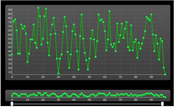
If you run the project now, the result should look similar to the image below:

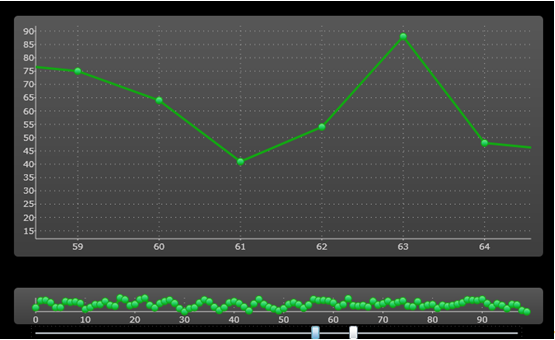
You can use the range slider below the bottom chart to select the range you are interested in. For example, if you dragged the slider's lower value to 55 and the upper value to 65, the upper chart would show the detail as in the image below:

You could improve this application by changing the template used by the range slider control. This is demonstrated in the "StockPortfolio" sample included with the ComponentOne Studio for Silverlight.