DataGrid for Silverlight supports ComponentOne's new ClearStyle technology that allows you to easily change control colors without having to change control templates. By just setting a few color properties you can quickly style the entire grid.
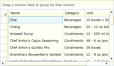
You can completely change the appearance of the C1DataGrid control by simply setting a few properties, such as the C1DataGrid.Background property which sets the color scheme of the C1DataGrid control. For example, if you set the Background property to "#FF663366" so the XAML markup appears similar to the following:
<c1:C1DataGrid HorizontalAlignment="Left" Margin="10,10,0,0" Name="c1DataGrid1" VerticalAlignment="Top" CanUserFreezeColumns="Left" CanUserGroup="True" Background="#FFFFFFCC"/>
The grid will appear similar to the following image:
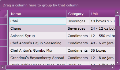
If you set the Background property to "#FF663366" and the Foreground property to "White", so the XAML markup appears similar to the following:
<c1:C1DataGrid HorizontalAlignment="Left" Margin="10,10,0,0" Name="c1DataGrid1" VerticalAlignment="Top" CanUserFreezeColumns="Left" CanUserGroup="True" Background="#FF663366" Foreground="White"/>
The grid will appear similar to the following image:
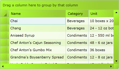
You can even set the Background property to a gradient value, for example with the following XAML:
<c1:C1DataGrid x:Name="c1DataGrid1" HorizontalAlignment="Left" Margin="10,10,0,0" VerticalAlignment="Top" CanUserFreezeColumns="Left" CanUserGroup="True">
<c1:C1DataGrid.Background>
<LinearGradientBrush StartPoint="0,0" EndPoint="1,1">
<GradientStop Color="GreenYellow" Offset="0.0" />
<GradientStop Color="YellowGreen" Offset="0.85" />
</LinearGradientBrush>
</c1:C1DataGrid.Background>
</c1:C1DataGrid>
The grid will appear similar to the following image: