ComponentOne DataGrid for Silverlight incorporates several themes that allow you to customize the appearance of your grid. When you first add a C1DataGrid control to the page, it appears similar to the following image:
This is the control's default appearance. You can change this appearance by using one of the built-in themes or by creating your own custom theme. All of the built-in themes are based on Silverlight Toolkit themes. The built-in themes are described and pictured below; note that in the images below, a cell has been selected and the mouse is hovering over another cell to show both selected and hover styles:
|
Theme Name |
Theme Preview |
|
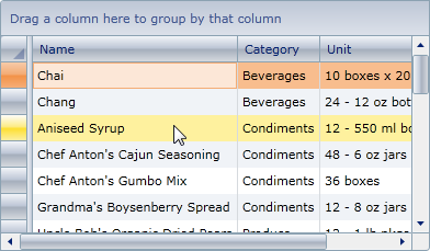
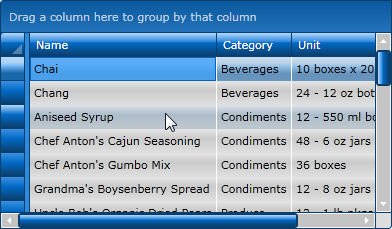
C1ThemeBureauBlack |
|
|
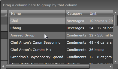
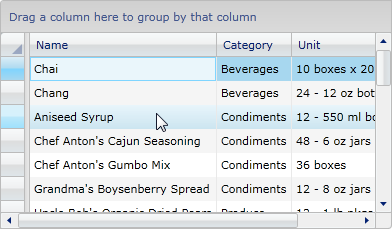
C1ThemeExpressionDark |
|
|
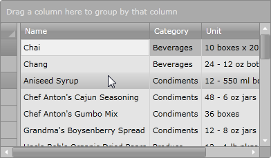
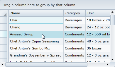
C1ThemeExpressionLight |
|
|
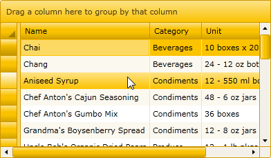
C1ThemeRainierOrange |
|
|
C1ThemeShinyBlue |
|
|
C1ThemeWhistlerBlue |
|