The Caption Style editor and the Column Style editor for a selected column allow you to specify the properties for the caption text and column text, respectively, as well as alignment, background, and borders.
The Caption Style and Column Style editors can only be accessed in the Column Tasks menu. For more information on the Column Tasks menu, see Column Tasks Menu.
The Caption Style and Column Style editors have four tabs: Text, Alignment, Background, and Borders. The Preview area allows you to view your settings before applying them to the grid.
Text
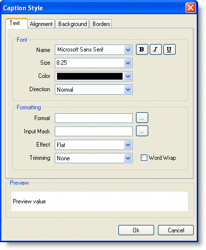
The Text tab sets the font and formatting of the caption.

The following options are available in the Font area:
- Name: Choose a font name.
- Size: Choose a font size.
- Color: Choose a font color.
- Direction: Choose from Normal, Up or Down.
- Font Effects: Use the buttons to toggle bold, italic, and underline on or off.
The following options are available in the Formatting area:
- Format: Click the ellipsis button to open the Format String dialog box. For more details on the Format String dialog box, see Cell Content.
- Input Mask: Click the ellipsis button to open the Input Mask dialog box. For more details on the Input Mask dialog box, see Masks.
- Effect: Choose from Flat, Raised, or Inset. For more details on the text effect options, see the TextEffectEnum Enumeration.
- Trimming: Choose from None, Character, Word, EllipsisCharacter, EllipsisWord, or EllipsisPath to set how long strings are trimmed to fit the cell.
- Word Wrap: Check the box to enable word wrapping for the caption.
Alignment
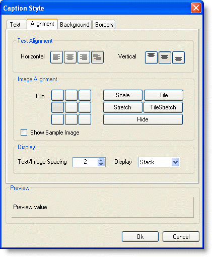
The Alignment tab sets the alignment of both text and images in the caption.

The following options are available in the Text Alignment area:
- Horizontal: Click the buttons to toggle between Align Left, Align Center, Align Right, and Align General.
- Vertical: Click the buttons to toggle between Align Top, Align Middle, and Align Bottom.
- The following options are available in the Image Alignment area:
- Clip: Click the buttons to toggle between image alignment in the cell or Scale, Tile, Stretch, TileStretch, or Hide the image. For more details on the image alignment options, see the ImageAlignEnum Enumeration.
- Show Sample Image: Check the Show Sample Image box to display a sample image in the Preview area.
- The following options are available in the Display area:
- Text/Image Spacing: Increase or decrease this value to increase or decrease the amount of space between the text and the image.
- Display: Choose from TextOnly, ImageOnly, Overlay, Stack, or None. For more details on the display options, see the DisplayEnum Enumeration.
Background
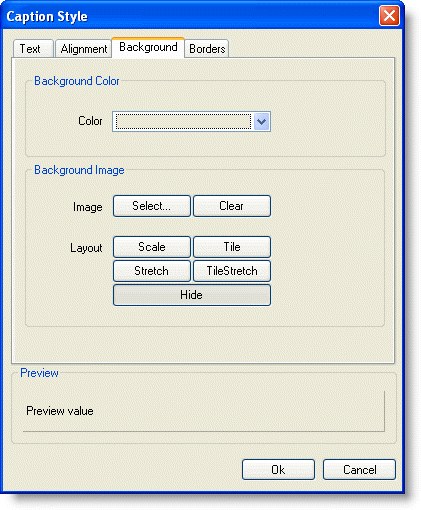
The Background tab sets the background color and background image.

The following option is available in the Background Color area:
- Color: Choose a color for the background of the cell.
The following options are available in the Background Image area:
- Image: Click the Select button to select an image or the Clear button to remove an image.
- Layout: Toggle between Scale, Tile, Stretch, TileStretch, or Hide.
Borders
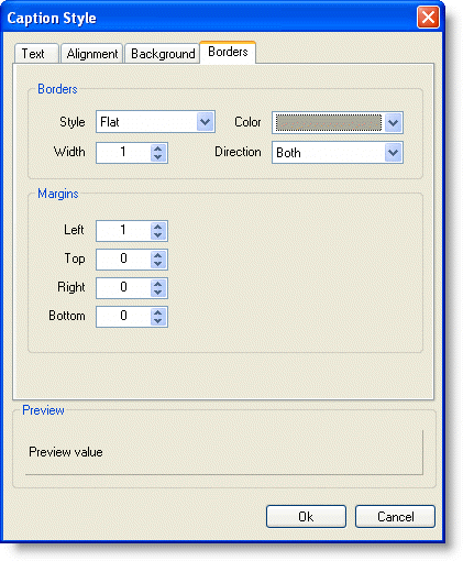
The Borders tab sets the borders and margins.

The following options are available in the Borders area:
- Style: Choose from None, Flat, Double, Raised, Inset, Groove, Fillet, or Dotted. For details on the different border style options, see the C1.Win.C1FlexGrid.BorderStyleEnum Enumeration.
- Width: Increase or decrease the value to increase or decrease the width of the border.
- Color: Choose a color for the border.
- Direction: Choose from Both, Horizontal, or Vertical. For details on the different border direction options, see the BorderDirEnum Enumeration.
The following options are available in the Margins area:
- Left: Increase or decrease the value to increase or decrease the left margin.
- Top: Increase or decrease the value to increase or decrease the top margin.
- Right: Increase or decrease the value to increase or decrease the right margin.
- Bottom: Increase or decrease the value to increase or decrease the bottom margin.