Key Features
The following are some of the main features of ComponentOne FlexGrid for LightSwitch that you may find useful:
•FlexGrid Screen Template
The ComponentOne FlexGrid Screen is a screen template that includes a properly configured instance of the C1FlexGrid control extension, similar to the built-in editable grid screen. This is the easiest way to use the product. Alternatively, developers can start with any screen that uses the built-in data grid and replace it with the C1FlexGrid extension.
•Edit Data in Spreadsheet or Form View
Users can choose to edit data directly in the grid, as in a spreadsheet, or use the command bar to open detail dialogs to add or edit data in form view.
•Data Paging
Optionally show large data sets page-by-page rather than in one, long scrollable grid.
•Search Engine
The FlexGrid screen template exposes the same search functionality found in the built-in LightSwitch data grid.
•Runtime Sorting and Filtering
Allow users to instantly sort and filter data with intuitive on-screen controls.
•Support for the Cosmopolitan theme
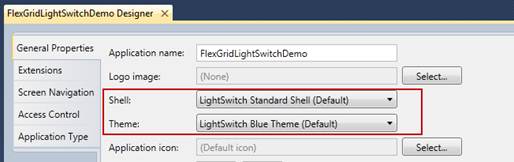
You can set the Shell and Theme of your FlexGrid to
Cosmopolitan in the General Properties.
•Design-time Grouping
Specify grouped views in LightSwitch’s property pane.
•Outline Buttons for Collapsing Groups
Create hierarchical views of your data with outline buttons that users can collapse and expand.
•True Excel Export for the Web
Users can export views to .csv, .html, or .txt files. This works for both desktop and Web deployments.
•Conditional Formatting
Set formatting for cells that exceed a high or low value in any given column. This is commonly used to indicate values that need attention. For example, you may want to use a red background for a number below an acceptable value.
•Cell Merging
FlexGrid enables cell merging at the grid and column levels. This feature merges adjacent cells that have the same content, while positioning the text to maximize readability.
•Support for the Built-in Summary Control
C1FlexGrid supports the native LightSwitch summary control, so the information in a Summary table will automatically link to the appropriate Detail table.
•Persistent User Views
Optionally restore the last view configured by the end-user before closing the application. This includes sorting and filtering operations as well as column sizing and reordering.
•Tooltips for Validation Errors
When modified field data is invalid, FlexGrid automatically shows a tooltip that explains what the error is.
•Excel-like Filtering
Allow your end-users to filter the grid view using convenient check boxes or by specifying conditional expressions.
•Printing Support
Print professional quality reports with the click of a button.
•Localized Interfaces
Deploy your application in 20 different languages without worrying about localization. Just set the Culture property in your LightSwitch project and FlexGrid will show the proper strings. Included languages:
•Arabic •Czech •Danish •Dutch •English (United States) •Finnish •French •German •Greek •Hebrew | •Italian •Japanese •Norwegian •Polish •Portuguese •Portuguese (Brazil) •Russian •Slovak •Spanish •Swedish |
•Cell Range Selection and Clipboard Support
Select multiple cells by clicking and dragging or shift-clicking. Use the keyboard shortcut CTRL+C to copy the selection to the clipboard.
•Point-and-click Styling
Use convenient property pickers in LightSwitch to customize the appearance of rows, columns, headers, and grid lines.
