By default, C1ViewPort's navigation bar is capable of holding header text, a left button, and a right button. You can alter the navigation bar so that it holds a series of segmented buttons (see Adding Segmented Buttons to the Navigation Bar), or you can customize the navigation bar with your own elements using the NavigationBarTemplate. In this tutorial, you will customize the navigation bar by changing its background color to black and adding a standard Button control to it.
Complete the following steps:
1. Click the Design tab to enter Design view.
2. From the Toolbox, double-click the ScriptManager icon to add the control to your project.
3. From the Toolbox, double-click the C1ViewPort icon to add the control to your project.
4. Click the Source tab to enter Source view.
5. Call the NavigationBarTemplate by entering the following markup between the <cc1:C1ViewPort> and </cc1:C1ViewPort> tags:
<NavigationBarTemplate></NavigationBarTemplate>
6. To alter the template with the new black background and the standard Button control, add the following markup between the <NavigationBarTemplate> and </NavigationBarTemplate> tags:
<div style="background-color:Black; width: 100%; height: 100%;">
<center>
<asp:Button ID="Button3" runat="server" Text="Button" />
</center>
</div>
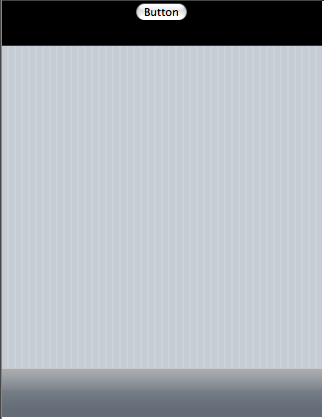
7. Open the project and observe that the navigation bar has a back background and holds a standard Button control. The result will resemble the following: