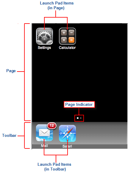
The C1LaunchPad control provides a familiar user interface for launching different aspects of your Web application. It allows for multiple pages of navigation and contains several elements, such as a content page with a page indicator, a toolbar, and launch pad items. The diagram below outlines each element of the C1LaunchPad control.
A launch pad page holds launch pad items and a page indicator. The page indicator automatically appears when the control contains two or more pages. To learn how to add pages to the C1LaunchPad control, see Adding a Page to the C1LaunchPad Control.
Like the launch pad's pages, the launch pad's toolbar can also hold launch pad items. However, the toolbar will remain static between page switches.
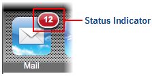
Launch pad items are used to link to applications or Web sites; they can be placed in the content area or in the toolbar of the launch pad. Launch pad items can hold a 57x57 pixel icon and text. You can also add a status indicator to a launch pad item by setting its StatusText property.
The C1LaunchPad control is represented by the C1LaunchPad class, while launch pad items are represented by the C1LaunchPadItem class.
Adding a C1LaunchPad Control to a Project
You can add a C1LaunchPad control to your project through the Visual Studio 2008 Toolbar by double-clicking the control or by dragging it onto your page using a drag-and-drop operation. You can also add it to a page using the following XHTML markup:
<cc1:C1LaunchPad ID="C1LaunchPad1" runat="server">
</cc1:C1LaunchPad>
For task-based help concerning the C1LaunchPad control, see Using the C1LaunchPad Control.