The C1TabBarController is strip of tabs used for navigation. The individual tabs of the C1TabBarController are represented by the C1TabBarItem class.
You can use C1TabBarController to provide tabbed navigation to the C1MultiView control by setting its MultiViewID property to your C1MultiView's ID. The control also has an OnClientSelectedIndexChanged event, so you can easily write a client-side script that will allow the tabs to perform other functions as well.
You can add images to the individual tabs by setting the ImageUrl property. You can also set the SelectedImageUrl and the DisabledImageUrl properties to an image. To adjust an image's positioning, you can set the ImagePaddingTop, ImagePaddingLeft, and ImagePaddingRight properties.
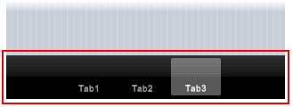
In the image below, a C1TabBarController control with three tabs rests on the toolbar of a C1ViewPort control.
The following markup was used to create the three tabs
in the above image:
<cc3:C1ViewPort ID="C1ViewPort1" runat="server">
<ToolBar>
<cc1:C1TabBarController ID="C1TabBarController1" runat="server">
<TabBarItems>
<cc1:C1TabBarItem ID="Tab1" runat="server" Text="Tab1" ButtonType="Destructive" />
<cc1:C1TabBarItem ID="Tab2" runat="server" Text="Tab2" />
<cc1:C1TabBarItem ID="Tab3" runat="server" Text="Tab3" />
</TabBarItems>
</cc1:C1TabBarController>
</ToolBar>
<Content>
For task-based help regarding the C1TabBarController control, see Using the C1TabBarController Control.