A header item helps define menu items into categories so it is easier to retrieve information from the menu. A header item is typically used in grouped menus as a group title like the following example.

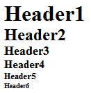
The header item’s heading tags h1-h6, ranging from large to small font size, can be specified using the HeaderType property. The following image illustrates the different type of heading tags, h1-h6.
Each heading tag for header items can be styled by modifying its CSS style. The following table lists the CSS selector style for each heading tag.
|
Header Item Style |
CSS Selector |
Description |
|
h1 |
.C1Menu_VisualStyleName .c1-h-flow h1.C1Heading { display: block; margin: 0; padding: 0; line-height:1em; font-size:1.5em; width:auto; background:#999 url(Images/arcticfox_header_bg.gif) repeat-x top left; } |
Defines the display, margin, padding, line-height, font-size, width, and background for the heading 1 tag in a horizontal menu. |
|
h2 |
.C1Menu_VisualStyleName .c1-h-flow h2.C1Heading { display: block; margin: 0; padding: 0; line-height:1em; font-size:1.2em; width:auto; background:#999 url(Images/arcticfox_header_bg.gif) repeat-x top left; } |
Defines the display, margin, padding, line-height, font-size, width, and background for the heading 2 tag in a horizontal menu. |
|
h3 |
.C1Menu_VisualStyleName .c1-h-flow h3.C1Heading { display: block; margin: 0; padding: 0; line-height:1em; font-size:1.1em; width:auto; background:#999 url(Images/arcticfox_header_bg.gif) repeat-x top left; } |
Defines the display, margin, padding, line-height, font-size, width, and background for the heading 3 tag in a horizontal menu. |
|
h4 |
.C1Menu_VisualStyleName .c1-h-flow h4.C1Heading { display: block; margin: 0; padding: 0; line-height:1em; font-size:1.0em; width:auto; background:#999 url(Images/arcticfox_header_bg.gif) repeat-x top left; } |
Defines the display, margin, padding, line-height, font-size, width, and background for the heading 4 tag in a horizontal menu. |
|
h5 |
.C1Menu_VisualStyleName .c1-h-flow h5.C1Heading { display: block; margin: 0; padding: 0; line-height:1em; font-size:0.9em; width:auto; background:#999 url(Images/arcticfox_header_bg.gif) repeat-x top left; } |
Defines the display, margin, padding, line-height, font-size, width, and background for the heading 5 tag in a horizontal menu. |
|
h6 |
.C1Menu_VisualStyleName .c1-h-flow h6.C1Heading { display: block; margin: 0; padding: 0; line-height:1em; font-size:0.8em; width:auto; background:#999 url(Images/arcticfox_header_bg.gif) repeat-x top left; } |
Defines the display, margin, padding, line-height, font-size, width, and background for the heading 6 tag in a horizontal menu. |
|
Horizontal header |
.C1Menu_VisualStyleName .disabled-item span.C1TextNode |
Defines the display, margin, padding, line-height, font-size, width, and background for the heading 1 tag in a horizontal menu. |
|
text |
.C1Menu_ArcticFoxNew .C1Heading span.C1TextNode { padding:.5em .2em; display:block; font-weight:900; color:#fff; line-height:1em; font-size:1em; } |
Defines the styles for the text in the heading items. |
|