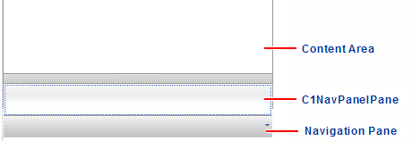
In this topic you will add a C1NavPanelPane to the C1NavPanel control and set some of its properties.
1. Click "C1NavPanel is Empty. Click here to add new pane". The C1NavPanel now contains a content area and one C1NavPanelPane. At run time, when a button is added to the navigation pane, the corresponding C1NavPanelPane is hidden, and the user can click the button to view information in the content area. This navigation pane is what makes the C1NavPanel control unique from the C1Accordion control.
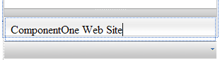
2. Click the new pane and enter ComponentOne Web Site.
3. Click the C1NavPanel smart tag to access the C1NavPanel Tasks menu where you can set frequently-used properties and tasks.
Note: Notice that OutlookUI is selected by default. This will give the C1NavPanel the Microsoft Outlook navigation bar style.
a. Enter 600px for the Width and 400px for the Height to adjust the size of the C1NavPanel.
b. Set the AutoSize property to Fill. This stretches the C1NavPanel, allowing for a larger content area at run time. The content area can include anything you want, such as text, links, graphics, and so on. You can use HTML and cascading style sheets to format the area as well.
c. Select Add new pane to add a second C1NavPanelPane. The second C1NavPanelPane is added below the current pane.
|