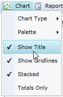
Using the Chart Menu
From the Chart menu, you can determine: the chart type, the palette, whether to show the chart title above the chart, whether to show chart gridlines, whether to show a stacked chart, and whether to show totals only.
Chart Type | Click Chart Type to select from five common chart types shown below. |
Palette | Click Palette to select from twenty-two palette options that define the colors of the chart and legend items. See the options in the Palette topic below. |
Show Title | When selected, shows a title above the chart. |
Stacked | When selected, creates a chart view where the data is stacked. |
Show Gridlines | When selected, shows gridlines in the chart. |
Totals Only | When selected, shows only totals as opposed to one series for each column in the data source. |
Chart Types
ComponentOne OLAP for Silverlight offers five of the most common chart types. The following table shows an example of each type.
|
|
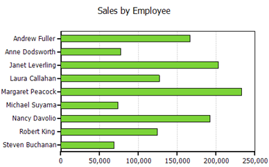
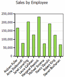
Bar |
|
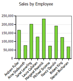
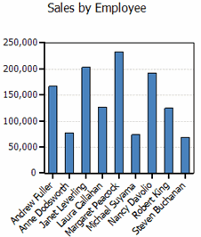
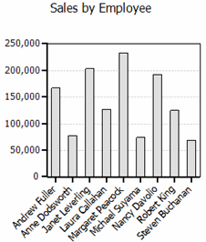
Column |
|
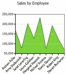
Area
|
|
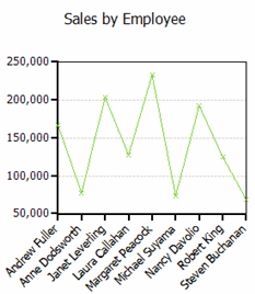
Line
|
|
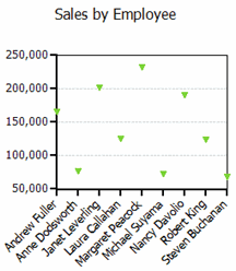
Scatter
|
|
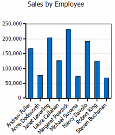
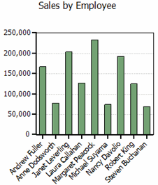
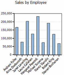
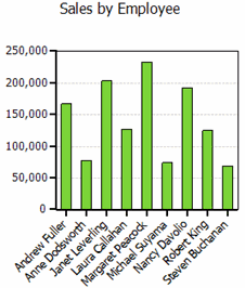
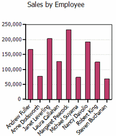
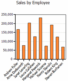
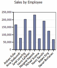
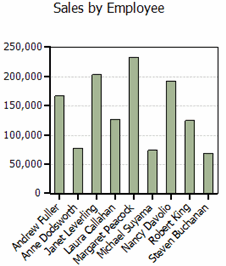
Palette
The C1OlapChart palette is made up of twenty-two options that define the colors of the chart and legend items. The following table shows the colors for each palette option.
|
|
|
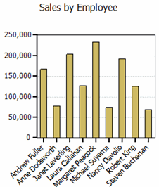
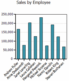
Standard
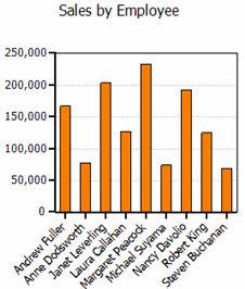
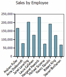
| Office
| GrayScale
|
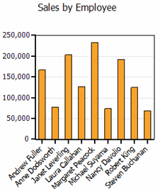
Apex
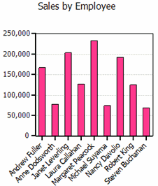
| Aspect
| Civic
|
Concourse
| Equity
| Flow
|
Foundry
| Median
| Metro
|
Module
| Opulent
| Oriel
|
Origin
| Paper
| Solstice
|
Technic
| Trek
| Urban
|
Verve
|
|
|