Customizing the C1PdfViewer Appearance
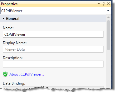
Following are the design time properties available for the C1PdfViewer-specific elements in the screen designer. All of the C1PdfViewer options appear in the General, Advanced, Appearance, and Sizing groups.

General
Name — The name used to refer to the control form from code.
Display Name — The name that will be displayed in the label for the control.
Description — If desired, enter more information about the control.
Data Binding — The database field or screen property the PdfViewer obtains data from.
Advanced
Data Location — Choices are Auto, File Name, URL, Reporting Services (SSRS).
Show Error Messages — If checked (the default), an error message will display to the user if an error occurs during document loading. If not checked, the C1PdfViewer will display a blank document if an error occurs during document loading.
Horizontal Scrollbar — Choices are Auto, Disabled, Hidden, Visible.
Vertical Scrollbar — Choices are Auto, Disabled, Hidden, Visible.
Selection Background Color — Choose the background color of selected text.
Page Separation — Sets the thickness of the separation between the pages.
Appearance
Control Type — C1PdfViewer by default.
Is Visible — If checked, the C1 PdfViewer is included in the final screen.
Label Position — Choices are Left-aligned, Right-aligned, Top, Bottom, None, and Collapsed.
Zoom — The default zoom of the document displayed.
Show ToolBar — If checked, the PdfViewer toolbar will be displayed.
View Mode — Choices are Normal, FitWidth, OnePage, and TwoPages.
Sizing
Horizontal Alignment — The horizontal alignment of the PdfViewer. Choose Left, Right, Center, or Stretch.
Width — The width of the PdfViewer can be set to Auto, you can choose a minimum and maximum width, or you can set the width in pixels.
Vertical Alignment — The vertical alignment of the PdfViewer. Choose Top, Bottom, Center, or Stretch.
Height — The height of the PdfViewer can be set to Auto, you can choose a minimum and maximum height, or you can set the height in pixels.