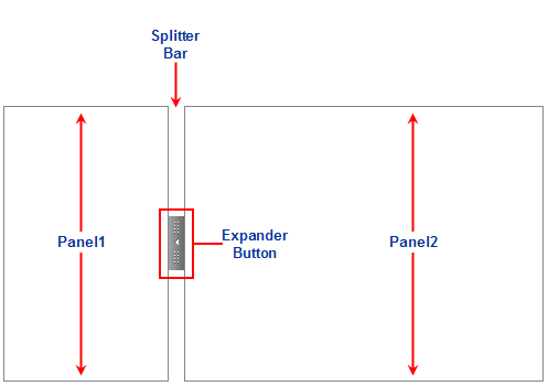
The C1Splitter container control consists of three basic objects: a SplitterBar, a SplitterPanel, and an expander button. The SplitterBar represents the divider that separates the two panels. The SplitterPanel object defines the appearance and behavior for Panel1 and Panel2.
The following image shows how the default vertical C1Splitter appears once it is added to the Web form:
 Splitter Control Visual Styles
Splitter Bar Width and Position
Splitter Bar Animation Effects
|