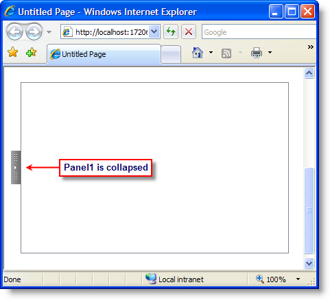
You can use the Collapsed property to specify a collapsed or expanded panel. The panels in C1Splitter can easily be collapsed or expanded by setting the Collapsed property to True or False (see Setting a Collapsed Splitter Panel). Once the property is set, you can click on the expander button to collapse or expand the panels.
The following image illustrates Panel1's Collapsed property set to True:
You may want to provide visual feedback, such as an image that represents a collapsed or expanded panel. The C1Splitter control provides additional properties for applying collapsible and expandable images - and, in addition, hover styles - to splitter bar, which enables you to create a friendlier user interface. You can use the CollapseImageUrl and ExpandImageUrl to apply collapsible and expandable images.
The CollapseHoverImageUrl and ExpandImageUrl properties can be used to apply hover styles to collapsible and expandable images.
|