By default, the tabs of a C1TabControl control will move to the next line or column if the number of tabs exceeds the room allowed by the tabstrip width or height. To avoid this, you can enable ScrollSettings.
The C1TabControl control contains three ScrollSettings properties: ScrollButtonAlign, ScrollMode, and ScrollPosition. These properties are described in the following table:
|
Property |
Description |
|
ScrollButtonAlign |
Gets or sets the alignment of the scroll buttons. The buttons can be set to StartSide, TwoSides, or EndSide. These options are outlined below: • StartSide: Selecting this option places both buttons on the starting side of the tabstrip. • TwoSides: Selecting this option places buttons on each side of the tabstrip. • EndSide: Selecting this option places both buttons on the ending side of the tabstrip. |
|
ScrollMode |
Gets or sets a value that determines which scroll mode is enabled. You can choose from None, Buttons, ButtonsHover, and Hover. These options are outlined below: • None: Selecting this option disables scrolling. • Buttons: Selecting this option will place two button images on the control. These buttons must be pressed in order to scroll through the tabstrip. • ButtonsHover: Selecting this option will place two button images on the control. Users can scroll through the tabstrip by hovering over one of the buttons. • Hover: Selecting this option enables users to scroll through the tabstrip by hovering over the first or last tab in a series. No buttons are shown. Note: When Hover is selected, users will always have to scroll through the tabstrip by hovering over the first or last tab regardless of what the ScrollButtonAlign property is set to. |
|
ScrollPosition |
Gets or sets the scroll position. This property will determine the position of the scrollable tabstrip at run-time. |
Examples of Tabstrip Scrolling
The following table shows examples of scroll settings. Please note that the ButtonsHover selection won't be shown in the following table; ButtonsHover will appear the same as the Buttons selection.
|
Settings |
Example |
|
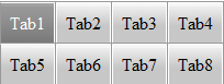
ScrollMode = None |
|
|
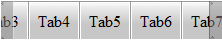
ScrollMode = Hover ScrollPosition = 300 |
|
|
ScrollButtonAlign = StartSide ScrollMode = Buttons ScrollPosition = 0 |
|
|
ScrollButtonAlign = EndSide ScrollMode = Buttons ScrollPosition = 100 |
|
|
ScrollButtonAlign = TwoSides ScrollMode = Buttons ScrollPosition = 200 |
|
For task-based help on C1TabControl scrolling, see Enabling Scrolling on a C1TabControl.
|