ComponentOne TabControl for WPF allows you to create customized, rich applications. Make the most of TabControl for WPF by taking advantage of the following key features:
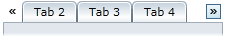
•Scroll Elements
The C1TabControl control will automatically insert scroll buttons when the amount of tabs exceeds the specified width or height of the control.
•Tabstrip Placement
The C1TabControl control's can be placed at the top, bottom, left, or right of the control.
•Tab Closing Options
Control whether the user can close tabs and where to show the close button. Display the close button inside each tab item or in a global location outside the tabstrip, just like Visual Studio does in its Documents tab.
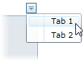
•Show Tabs in a Menu
The C1TabControl control has an optional tab menu that can be activated by setting the TabStripMenuVisibility property to Visible. The tab menu enables users to open tab pages using a drop-down menu.
•Customize the Header's Shape
You can modify the shape of the tab headers using the TabItemShape property in the TabControl; select from Rounded, Rectangle, and Sloped. This is ideal for non-designer users; you don't need to change the template of the control to change the shape of the tab headers.
•New Tab Item
C1TabControl includes built-in support for the new tab item with a uniform look and feel with the rest of the tabs, just like Microsoft Internet Explorer 8.
•Align Items in the Header
Define if the tab items are overlapped with the right-most in the back or the left-most in the back. The selected item is always on top.
•Change the Background
Keeping the appearance of the tab, you can change its background. While this seems like a very simple feature, C1TabControl is the only tab control in the market that allows you to change the background without having to customize the full template.
•Overlap Headers
Overlap between tab items headers can be customized to show jagged tabs, like the Documents tab in Microsoft Visual Studio.