When a tab (C1TabItem) is added to a C1TabControl control, it will have a corresponding tab page that will initially appear as an empty space. In the tab page, you can add grids, text, images, and arbitrary controls. When working in Blend or Visual Studio's Design view, you can add elements to the tab page using a simple drag-and-drop operation.
You can add text to the tab page by setting the item's Content property or by adding a TextBox element to the tab page. Adding elements to the tab page at run time is simple: You can either use simple drag-and-drop operations or XAML in Visual Studio or Blend. If you'd prefer to add a control at run time, you can use C# or Visual Basic code.
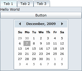
A C1TabItem item can only accept one child element at a time. However, you can circumvent this issue by adding a panel-based control as its child element. Panel-based controls, such as a StackPanel control, are able to hold multiple elements. The panel-based control meets the one control limitation of the C1TabItem item, but its ability to hold multiple elements will allow you to show several controls in the tab page.
Attribute Syntax versus Property Element Syntax
When you want to add something simple to the tab page, such as an unformatted string or a single control, you can simply use the common XML attributes in your XAML markup, such as in the following:
<c1:C1TabItem Content="Hello World"/>
However, there may be times where you want to add more complex elements, such as grids or panels, to the tab page. In this case you can use property element syntax, such as in the following:
<c1:C1TabItem>
<c1:C1TabItem.Content>
<StackPanel>
<TextBlock Text="Hello"/>
<TextBlock Text="World"/>
</StackPanel>
</c1:C1TabItem.Content>
</c1:C1TabItem>
You can also customize the content using the ContentTemplate.