ComponentOne DateTimeEditors for WPF includes the C1DateTimePicker control, a simple control which provides, by default, both a date picker and a time picker. When you add the C1DateTimePicker control to a XAML window, it exists as a completely functional date and time picker. By default, the control's interface looks similar to the following image:
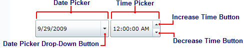
The C1DateTimePicker control consists of the following elements:
• Date Picker
The date picker element is comprised of a date field and the calendar drop-down button. You can set the date by entering numeric values or by selecting a date from the calendar.
• Time Picker
The time picker element is comprised of the time field, the increase time button, and the decrease time button. You can set the time by entering numeric values or by clicking the buttons.
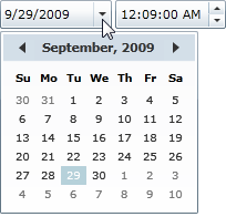
• Date Picker Drop-Down Button
The date picker drop-down button opens a calendar from where you can select a date for the date picker.
• Increase Time Button
The increase time button allows you to increase the time displayed in the time picker. Clicking the increase button will increase the time by one minute.
• Decrease Time Button
The decrease time button allows you to decrease the time displayed in the time picker. Clicking the decrease button will decrease the time by one minute.
|