Step 3 of 3: Adding a C1ToolbarStrip and C1ToolbarToggleButtons to C1ToolbarGroup
In this step you'll continue in Visual Studio by adding a C1ToolbarStrip to your ‘Font’ C1ToolbarGroup and then you will add C1ToolbarToggleButtons to the C1ToolbarGroup.
1. Select the Font C1ToolbarGroup and and add a C1ToolbarStrip in XAML.
<c1:C1ToolbarGroup Header="Font">
<c1:C1ToolbarStrip />
</c1:C1ToolbarGroup>
The rest of your XAML should appear like the following:
<c1:C1Toolbar Grid.Row="1" Name="c1Toolbar1"
<c1:C1ToolbarGroup Header="Clipboard">
<c1:C1ToolbarButton LabelTitle="Paste" />
<c1:C1ToolbarButton LabelTitle="Cut" />
<c1:C1ToolbarButton LabelTitle="Copy" />
</c1:C1ToolbarGroup>
<c1:C1ToolbarGroup Header="Font">
<c1:C1ToolbarStrip />
</c1:C1ToolbarGroup>
</c1:C1Toolbar>
2. Select the C1ToolbarStrip and open its Items collection editor
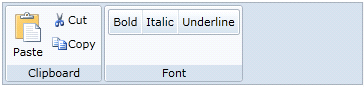
3. Select the C1ToolbarToggleButton from the Select item dropdown and click Add three three times to add three C1ToolbarToggleButtons; set each LabelTitle property to: Bold, Italic, and Underline. Click OK to close the Items collection editor.
<c1:C1ToolbarGroup Header="Font">
<c1:C1ToolbarStrip>
<c1:C1ToolbarToggleButton LabelTitle="Bold" />
<c1:C1ToolbarToggleButton LabelTitle="Italic" />
<c1:C1ToolbarToggleButton LabelTitle="Underline" />
</c1:C1ToolbarStrip>
</c1:C1ToolbarGroup>
Congratulations! You've now completed creating a toolbar UI using Toolbar for WPF.
Further topics:
•Adding Logic Behind the ToolbarButton Click Event – This topic shows you how to use button click events to add logic behind buttons
•Commanding with C1Toolbar for Silverlight – This tutorial demonstrates how to use C1Toolbar with commands in a Silverlight application
•Button Size and Text Position in C1ToolbarGroup – This topic shows you how to use GroupSizeDefinitions of the C1ToolbarGroup.
•Toolbar Tab Item – This topic shows you how to add the C1ToolbarTabItem control.