ComponentOne TreeView for WPF's C1TreeView control provides several style properties that you can use to change the appearance of the control. Some of the included styles are described in the table below:
Style | Description |
Gets or sets the style used by this element when it is rendered. This is a dependency property. |
TreeView for WPF supports ComponentOne's ClearStyle technology, which allows you to easily change control colors without having to change control templates. By setting a few color properties, you can quickly style the C1TreeView control. The supported properties for C1TreeView are listed in the following table:
Property | Description |
Background | Gets or sets the background used to fill the C1DockControl. |
MouseOverBrush | Gets or sets the brush used to highlight the control when the mouse is hovering over it. |
SelectedBackground | Gets or sets the background color of the selected item. |
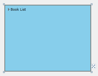
You can completely change the appearance of the C1TreeView by setting these properties. For example, if you set the C1TreeView.Background property to SkyBlue so the XAML markup appears similar to the following:
<c1:C1TreeView Background="SkyBlue" x:Name="Tree">
<c1:C1TreeViewItem Header="Book List">
<c1:C1TreeViewItem Header="Language Books"/>
<c1:C1TreeViewItem Header="Security Books"/>
<c1:C1TreeViewItem Header="Classic Books">
<c1:C1TreeViewItem Header="Catch-22"/>
<c1:C1TreeViewItem Header="The Great Gatsby"/>
</c1:C1TreeViewItem>
</c1:C1TreeViewItem>
</c1:C1TreeView>
The C1TreeView will look similar to the following:
Experiment with the other properties to quickly change the look of the C1TreeView elements. For example, the following XAML sets the Background, MouseOverBrush, and SelectedBackground properties:
<c1:C1TreeView Background="SkyBlue" MouseOverBrush="Gold" SelectedBackground="Green" x:Name="Tree">
<c1:C1TreeViewItem Header="Book List">
<c1:C1TreeViewItem Header="Language Books"/>
<c1:C1TreeViewItem Header="Security Books"/>
<c1:C1TreeViewItem Header="Classic Books">
<c1:C1TreeViewItem Header="Catch-22"/>
<c1:C1TreeViewItem Header="The Great Gatsby"/>
</c1:C1TreeViewItem>
</c1:C1TreeViewItem>
</c1:C1TreeView>
The C1TreeView will look similar to the following when you run the project:
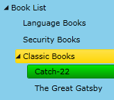
When you mouse over a header, it appears yellow. When you select an item, it appears green.