The appearance and functionality of C1Upload’s User Interface elements are controlled by the AddButtonText, CancelButtonText, UploadButtonText, MaximumFiles, and ShowProgress properties.
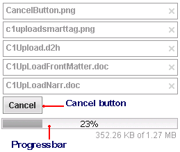
C1Upload, by default, consists of six different elements: the add file button, upload button, file window, close button, cancel button and progress bar. These elements are labeled in the following images.
The following images display two C1Upload controls shown with one before file upload and one during file upload.
|
C1Upload Before File Upload |
C1Upload During File Upload |
|
|
|
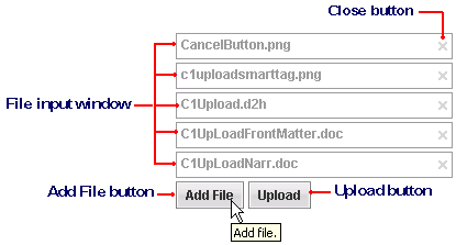
The following table describes each of the elements that appear on the C1Upload control:
|
Element |
Description |
|
Close Button |
Button that removes the file from C1Upload and closes the window. A tooltip automatically appears when you hover over the close button at run time. The tooltip for the close button says “remove this file”. |
|
File Window |
The file dialog box represents a dialog box for each file that is added to the C1Upload control. |
|
Add File Button |
The Add File button adds one file at a time to the C1Upload control. Use the AddButtonText property to change the text of the Add File button. A tooltip automatically appears when you hover over the Add File button at run time. The default tooltip reads, “Choose a file to add.” This can be changed by setting a new string value to the C1Upload.AddButtonToolTip property. |
|
Upload Button |
The Upload button uploads the files when it is clicked. Use the UploadButtonText property to change the text of the Upload button. A tooltip automatically appears when you hover over the Upload button at run time. The default tooltip reads, “Choose a file to add.” This can be changed by setting a new string value to the C1Upload.UploadButtonToolTip property. |
|
Cancel Button |
The Cancel button appears when the file is uploading. You can change the text of the cancel button by assigning a different string value to the CancelButtonText property. A tooltip automatically appears when you hover over the Cancel button at run time. The default tooltip reads, “Cancel the upload session.” This can be changed by setting a new string value to the CancelButtonToolTip property. |
|
Progress Bar |
The built-in progress bar appears for C1Upload while files are being uploaded and when ShowProgress property is set to true. For more information about the built-in progress bar, see Progress Bar Elements. |
|