Candle, HiLo, HiLoOpenClose charts are all types of Stock charts used in financial applications to show the opening, closing, high and low prices of a given stock. A Candle chart is a special type of HiLoOpenClose chart that is used to show the relationship between the open and close as well as the high and low. Like, HiLoOpenClose charts, Candle charts use the same price data (high, low, open, and close values) except they include a thick candle-like body that uses the color and size of the body to reveal additional information about the relationship between the open and close values. For example, long transparent candles show buying pressure and long filled candles show selling pressure.
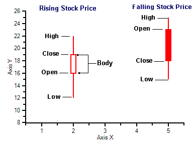
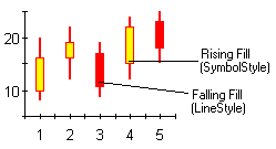
The Candle chart is made up of the following elements: candle, wick, and tail. The candle or the body (the solid bar between the opening and closing values) represents the change in stock price from opening to closing. The thin lines, wick and tail, above and below the candle depict the high/low range. A hollow candle or transparent candle indicates a rising stock price (close was higher than open). In a hollow candle, the bottom of the body represents the opening price and the top of the body represents the closing price. A filled candle indicates a falling stock price (open was higher than close). In a filled candle the top of the body represents the opening price and the bottom of the body represents the closing price.
C1Chart creates the Candle chart with using the Y value for the High, Y1 for the low, Y2 for the open, and Y3 for the close. C1Chart automatically fills the falling candle with the value of the line color.

Using the LineStyle and SymbolStyle properties and the HiLoData class, the fill and line properties of each series can be customized. For more information, see Special Candle Chart Properties. To see how to create a candle chart from start to finish using the designer or programmatically, see Candle Chart Tutorial.

To set the chart type to Candle at design time
•Expand the ChartGroups node in the Properties window. Open the ChartGroups Collection Editor by clicking the ellipsis button. In the right pane of the editor, set the ChartType property to Candle.
•An alternate method to change chart type is to right-click the existing chart and select Chart Properties. From the Gallery, select ChartType as Stock and Chart sub-type as Candle.
•Another alternate method is to select Chart Properties from the Properties pane. From the Gallery, select ChartType as Stock and Chart sub-type as Candle.