This section provides instructions for building a Line Chart with symbols which is the default chart type. A Line chart is another simple way to show the relationship of the data.
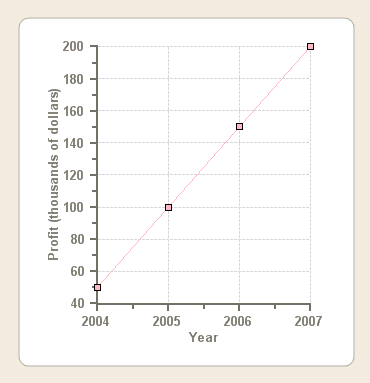
In this example we will create a Line chart with symbols. There will be only one line so we will use one data series. The line will display the company's profit growth over time. The horizontal axis, in this example, Axis X, represents years and the vertical axis, in this example, AxisY, represents profit in thousands of dollars.
Once you complete the following steps your chart will appear like the following line chart with symbols:
To create a Line Chart with Symbols at design
time![]()
This task assumes you have already added the C1Chart control to the form.
Set the Chart Type
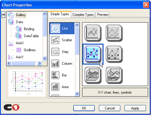
The first step in configuring a chart through the Chart Properties designer is to select a gallery type from the available chart types.
1. Right-click on the C1Chart control and click Chart Properties from its short-cut menu.
2. Select Gallery from the treeview pane, then select Line from the Simple Types list.
3. In the pane next to the main chart types, select the X-Y chart, lines, symbols subtype, and click Apply.
The default Line chart will add two data series which will create two lines.
Modify the Data Series
4. Select Data from the treeview pane.
5. Click Remove to remove Series 1, Series 2, and Series 3.
Add Data to the Data Series
6. Select Data->DataTable from the treeview pane. Click in the XY data table and enter the following numerical X-Y-values: (2004,50), (2005,100), (2006, 150), (2007, 100).
Note: Click Tab to move the cursor to the next X or Y value.
7. Delete the last XY value from the default line chart.
8. Click Apply to update the chart.
A preview image of the updated chart appears in the lower left pane of the Chart Properties designer.
Modify Axes Appearance
Next we will modify the X and Y axis default title and we will also change the axes font style using the Chart Properties designer. Select AxisX from the treeveiw pane, then select the annotation tab.
9. Select AxisX from the tree.
10. In the AxisX tab, type the title, "Year", then click on the Font button. The Font dialog box appears.
11. Change the Font style to Bold and the Font size to 10, then click OK.
12. Click Apply in the Chart Properties designer. The modifications for the X-Axis appear on the Line chart.
13. Select AxisY from the tree.
14. In the AxisY tab, type the title, "Profit (thousands of dollars)", then click on the Font button. The Font dialog box appears.
15. Change the Font style to Bold and the Font size to 10, then click OK.
16. Click Apply in the Chart Properties designer. The modifications for the Y-Axis appear on the Line chart.
17. Click OK to close the Chart Properties designer.
Contratulations! You created a Line symbol chart using the Chart Properties designer.
To create a Line Chart with Symbols
programmatically![]()
A Line chart can be created programmatically using the following steps:
1. Add C1Chart to the form.
2. Right-click the form and select View Code to view the code file, then add the following directive to declare the C1.Win.C1Chart namespace:
Imports C1.Win.C1Chart;
•C#
using C1.Win.C1Chart;
3. Double click Form1 and add the following code in the Form1_Load procedure to create the simple pie chart:
Private Sub Form1_Load(ByVal sender As System.Object, ByVal e As System.EventArgs) Handles MyBase.Load
'create data for the chart
Dim xdata() As Double = {2004, 2005, 2006, 2007}
Dim ydata() As Double = {50, 100, 150, 200}
'clear previous series
C1Chart1.ChartGroups(0).ChartData.SeriesList.Clear()
'add one series to the chart
Dim ds As C1.Win.C1Chart.ChartDataSeries = _ C1Chart1.ChartGroups(0).ChartData.SeriesList.AddNewSeries()
'copy the x and y data
ds.X.CopyDataIn(xdata)
ds.Y.CopyDataIn(ydata)
'set the chart type
C1Chart1.ChartGroups(0).ChartType = C1.Win.C1Chart.Chart2DTypeEnum.XYPlot
'create new font for the X and Y axes
Dim f As Font = New Font("Arial", 10, FontStyle.Bold)
C1Chart1.ChartArea.Style.ForeColor = Color.DarkGray
C1Chart1.ChartArea.AxisX.Font = f
C1Chart1.ChartArea.AxisX.Text = "Year"
C1Chart1.ChartArea.AxisX.GridMajor.Visible = True
C1Chart1.ChartArea.AxisX.GridMajor.Color = Color.LightGray
C1Chart1.ChartArea.AxisY.Font = f
C1Chart1.ChartArea.AxisY.Text = "Profit (thousands of dollars)"
C1Chart1.ChartArea.AxisY.GridMajor.Visible = True
C1Chart1.ChartArea.AxisY.GridMajor.Color = Color.LightGray
'change the default line style appearance
ds.LineStyle.Color = Color.LightPink
ds.LineStyle.Pattern = LinePatternEnum.Solid
ds.LineStyle.Thickness = 1
'change the default symbol style appearance
ds.SymbolStyle.Shape = SymbolShapeEnum.Box
ds.SymbolStyle.Color = Color.LightPink
ds.SymbolStyle.OutlineColor = Color.Black
ds.SymbolStyle.Size = 5
ds.SymbolStyle.OutlineWidth = 1
'set the backcolor for the plot area
C1Chart1.ChartArea.PlotArea.BackColor = Color.White
End Sub
•C#
private void Form1_Load(object sender, EventArgs e)
{
//create data for the chart
double[] xdata = { 2004, 2005, 2006, 2007 };
double[] ydata = { 50, 100, 150, 200 };
//clear previous series
c1Chart1.ChartGroups[0].ChartData.SeriesList.Clear();
//add one series to the chart
C1.Win.C1Chart.ChartDataSeries ds = c1Chart1.ChartGroups[0].ChartData.SeriesList.AddNewSeries();
//copy the x and y data
ds.X.CopyDataIn(xdata);
ds.Y.CopyDataIn(ydata);
//set the chart type
c1Chart1.ChartGroups[0].ChartType = C1.Win.C1Chart.Chart2DTypeEnum.XYPlot;
//create new font for the X and Y axes
Font f = new Font("Arial", 10, FontStyle.Bold);
c1Chart1.ChartArea.Style.ForeColor = Color.DarkGray;
c1Chart1.ChartArea.AxisX.Font = f;
c1Chart1.ChartArea.AxisX.Text = "Year";
c1Chart1.ChartArea.AxisX.GridMajor.Visible = true;
c1Chart1.ChartArea.AxisX.GridMajor.Color = Color.LightGray;
c1Chart1.ChartArea.AxisY.Font = f;
c1Chart1.ChartArea.AxisY.Text = "Profit (thousands of dollars)";
c1Chart1.ChartArea.AxisY.GridMajor.Visible = true;
c1Chart1.ChartArea.AxisY.GridMajor.Color = Color.LightGray;
//modify line style appearance
ds.LineStyle.Color = Color.LightPink;
ds.LineStyle.Pattern = LinePatternEnum.Solid;
ds.LineStyle.Thickness = 1;
//modify the symbol style appearance
ds.SymbolStyle.Shape = SymbolShapeEnum.Box;
ds.SymbolStyle.Color = Color.LightPink;
ds.SymbolStyle.OutlineColor = Color.Black;
ds.SymbolStyle.Size = 5;
ds.SymbolStyle.OutlineWidth = 1;
c1Chart1.ChartArea.PlotArea.BackColor = Color.White;
}