Pie charts are commonly used to display simple values. They are visually appealing and often displayed with 3D effects such as shading and rotation. C1Chart allows you to add 3D effects to charts, but you should use them carefully because they distort the data.
Pie charts have one significant difference when compared to other C1Chart chart types: in Pie charts, each series represents one slice of the pie. Therefore, you will never have Pie charts with a single series (they would be just circles). In most cases, Pie charts have multiple series (one per slice) with a single data point in each series. C1Chart represents series with multiple data points as multiple pies within the chart.
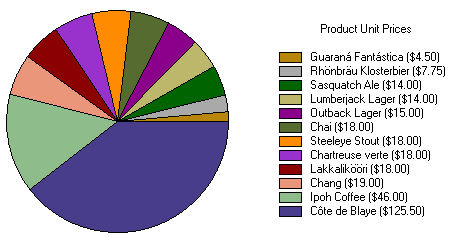
This arrangement makes sense when you think of the labels used to identify each series and how they are displayed in the chart legend. The following chart illustrates the same sales data as a pie chart.
The code used to create this chart is significantly different from the bar chart code. It creates one series per value, each with a single data point. The following example creates the chart shown in the preceding graphic:
' get chart data
Dim data As DataView = _dataSet.Tables["Products"].DefaultView
data.Sort = "UnitPrice"
data.RowFilter = "CategoryID = 1" ' beverages
' configure chart
C1Chart1.Reset()
C1Chart1.BackColor = Color.White
C1Chart1.ChartArea.Style.Font = new Font("Tahoma", 8)
C1Chart1.ChartGroups(0).ChartType = Chart2DTypeEnum.Pie
' get series collection (pies have one series per slice)
Dim dscoll As ChartDataSeriesCollection = C1Chart1.ChartGroups(0).ChartData.SeriesList
dscoll.Clear()
' populate the series
Dim i As Integer
For i = 0 To data.Count – 1
Dim series As ChartDataSeries = dscoll.AddNewSeries()
series.PointData.Length = 1
series.Y(0) = data(i)("UnitPrice")
series.Label = String.Format("{0} ({1:c})", _
data(i)("ProductName"), data(i)("UnitPrice"))
Next I
' show pie legend
C1Chart1.Legend.Visible = True
C1Chart1.Legend.Text = "Product Unit Prices"
•C#
// get chart data
DataView data = _dataSet.Tables["Products"].DefaultView;
data.Sort = "UnitPrice";
data.RowFilter = "CategoryID = 1"; // beverages
// configure chart
c1Chart1.Reset();
c1Chart1.BackColor = Color.White;
c1Chart1.ChartArea.Style.Font = new Font("Tahoma", 8);
c1Chart1.ChartGroups[0].ChartType = Chart2DTypeEnum.Pie;
// get series collection (pies have one series per slice)
ChartDataSeriesCollection dscoll = c1Chart1.ChartGroups[0].ChartData.SeriesList;
dscoll.Clear();
// populate the series
for (int i = 0; i < data.Count; i++)
{
ChartDataSeries series = dscoll.AddNewSeries();
series.PointData.Length = 1;
series.Y[0] = data[i]["UnitPrice"];
series.Label = string.Format("{0} ({1:c})",
data[i]["ProductName"], data[i]["UnitPrice"]);
}
// show pie legend
c1Chart1.Legend.Visible = true;
c1Chart1.Legend.Text = "Product Unit Prices";