A Radar chart draws the y value in each data set along a radar line (the x value is ignored except for labels). If the data has n unique points, then the chart plane is divided into n equal angle segments, and a radar line is drawn (representing each point) at n/360 degree increments. By default, the radar line representing the first point is drawn vertically (at 90 degrees). The series can be drawn independently or stacked.
Radar charts can display tickmarks in the radial direction along X axis major gridlines. The tickmarks are controlled by the Y axis tickmark properties. For more information about the tickmark properties see, Axis Tick Marks.
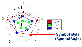
Using the LineStyle and SymbolStyle, the line and symbol properties of each series can be customized. For more information, see Line and Symbol Styles for the Series.
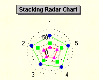
Use the ChartGroup object's Stacked property to create a stacking Radar chart. Stacking charts represent the data by stacking the values for each series on top of the values from the previous series.
To set the chart type to Radar at design time
•Expand the ChartGroups node in the Properties window. Open the ChartGroups Collection Editor by clicking the ellipsis button. In the right pane of the editor, set the ChartType property to Radar.
•An alternate method to change chart type is to right-click the existing chart and select Chart Properties. From the Gallery, select ChartType as Radar.
•Another alternate method is to select Chart Properties from the Properties pane. From the Gallery, select ChartType as Radar.