C1WebTreeView control contains items and groups. Each item may or may not include a child group. C1WebTreeView includes the following basic types of items: Link, Custom Content, and Separators.
Link Items
Link items are derived from the base class C1WebLinkItem. C1WebTreeView's link items can be easily configured to represent a set of links by using the NavigateUrl property for each item. Please remember that like menu items you can't specify both a ClientScripts and a NavigateUrl for the same link item.
To access the NavigateUrl property using the C1WebCommandEditor C1WebTreeView collection editor, follow the steps below:
1. Right-click on C1WebTreeView and select Edit from its C1WebTreeView Tasks menu. The C1WebCommandEditor C1WebTreeView appears.
2. Select an item from the tree view.
3. Expand the Appearance node in the item's properties window.
There are five styles and states for the link items. Each style and state is determined by its property settings for Enabled and Selected.
|
Style |
State |
Property Settings |
|
ItemStyle |
Normal |
Enabled = True, Selected = False, mouse doesn't hover over item. |
|
MouseOverItemStyle |
Mouse Over |
Enabled = True, Selected = False, mouse hovers over item. |
|
SelectedItemStyle |
SelectedState |
Enabled = True, Selected = True, mouse doesn't hover over item. |
|
MouseOverSelectedItemStyle |
Mouse Over Selected |
Enabled = True, Selected = True, mouse hovers over item. |
|
DisabledItemStyle |
Disabled |
Enabled = False |
The item styles listed above are accessible programmatically through C1WebLinkItems object or by the design editor, C1WebCommandEditor C1WebTreeView Collection Editor.
To access the C1WebLinkItem's style properties using the C1WebCommandEditor C1WebTreeView Collection Editor, complete the following steps:
1. Right-click on C1WebTreeView and select Edit from its C1WebTreeView Tasks menu. The C1WebCommandEditor C1WebTreeView appears.
2. Select an item from the tree view.
3. Expand the Style node in the item's properties window.
To access the C1WebLinkItem's style properties programmatically, use the following code:
'Create an instance of the class
Dim treeview As C1WebTreeView = New C1WebTreeView()
'Add the C1WebLinkItem.MouseOverMenuLinkItem style to the C1WebTreeView
treeview.MouseOverItemStyle.CssClass = "MouseOverMenuLinkItem"
C#
// create an instance of the class
C1WebTreeView treeview = new C1WebTreeView();
//Add the C1WebLinkItem.MouseOverMenuLinkItem style to the C1WebTreeView
treeview.MouseOverItemStyle.CssClass = "MouseOverMenuLinkItem";
This method can be applied the same way for the remaining C1WebLinkItem properties. Note that you first need to create an instance of C1WebMenu, C1WebTreeView, C1WebTopicBar, or C1WebTabStrip class before you apply the C1WebLinkItem's properties to it.
Custom Content Items
Custom content items are derived from the base class C1WebContentItem. Each item includes content property. The Content property includes built-in editable templates and controls such as a calendar control.
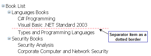
Separators
C1WebTreeView's items can be displayed as separators. Separators are also known as delimiters. The user has the option to customize the separators' color, size, style, and padding. The figure below displays the separator as a dotted border.
For more information on separators, see Defining the Separator Style and its Types.
|