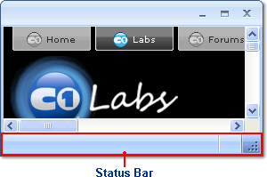
The status bar appears at the bottom of the C1Window dialog window when the StatusVisible property is set to True. By default StatusVisible is set to False and the status bar is not visible. You can use the status bar element to present information and updates as you would in a traditional WinForms dialog box. You can also use the status bar to provide a page loading indicator.
The following diagram labels the status bar element:

C1Window includes the following properties to make it simple to add and customize content in the status area:
To show the status bar use the StatusVisible property. For details see, Showing the Status Bar.
You can enter text in the status bar area of the dialog window at design time. When you enter text into the status bar area, C1Window adds a <StatusTemplate> tag inside the <cc1:C1Window> tag like the following:
<cc1:C1Window ID="C1Window1" runat="server" AllowResize="True" Height="150px" VisualStylePath="~/C1WebControls/VisualStyles" Width="300px" X="0" Y="0">
<StatusTemplate>
This is where the status bar content is placed.
</StatusTemplate>
...
</cc1:C1Window>
The status bar includes a page loading image that appears in the lower left corner, and by default is set to a spinner image:

The location and appearance of this image varies depending on the theme used. For example in the ArcticFox theme the loading image appears on the left side of the status bar. You can customize this loading image with your own animated graphic. See the Setting the Loading Image topic for information.
You can add a style sheet to style the status bar's appearance. See Customizing the Status Bar for more information.
|
