You can easily change the appearance of the Grid for WPF sort indicator in Expression Blend by using the AscendingSortIndicatorTemplate and DescendingSortIndicatorTemplate properties. In the following steps you'll visually edit the sort indicator templates in Blend to change the color of the sort indicator arrows in design view and using XAML.
1. Complete steps 1 and 2 of the Grid for WPF Quick Start to create a new WPF project, add a C1DataGrid control to the project, and bind the project to a data source.
2. In Blend, click once on the C1DataGrid control to select C1DataGrid1.
3. Click the C1DataGrid1 menu, and select Edit Other Templates | Edit AscendingSortIndicatorTemplate | Edit a Copy.

4. In the Create ControlTemplate Resource dialog box change the template's name to "CustomAscending" and click OK.

The new control template will appear in Blend and in the XAML the <ControlTemplate x:Key="CustomAscending"> tag is added to the <Window.Resources> tag.
Notice that the template consists of a black polygon shape. You'll customize the appearance of this polygon to change the appearance of the ascending sort indicator.
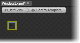
You can zoom in to better view the template.
5. Click the Polygon shape within the Control Template to select it.
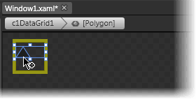
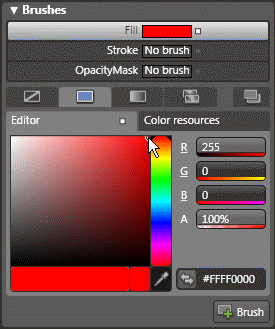
6. Navigate to the Properties window and make sure that Fill brush and the Solid color brush tab are selected in the Brushes tab.
7. Select a new Fill color for the sort indicator; in the image below the color red (or #FFFF0000) was selected:
8. Select the Stroke brush and the Solid color brush tab and choose a color for the sort indicator's outline. Here the color black (#FF000000) was selected:
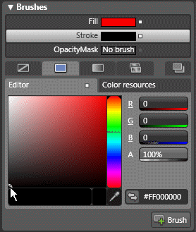
Note that the XAML of the control template now appears similar to the following:
<ControlTemplate x:Key="CustomAscending">
<Polygon Margin="0,3,0,0" VerticalAlignment="Top" Fill="#FFFF0000" Points="0,7.6 5,0 10,7.6" Stroke="#FF000000"/>
</ControlTemplate>
In the next step you'll add the descending sort item indicator using XAML.
9. To add a descending sort item indicator template, add the following XAML within the <Window.Resources> tag and under the <ControlTemplate x:Key="CustomAscending"> tag:
<ControlTemplate x:Key="CustomDescending">
<Polygon Margin="0,3,0,0" VerticalAlignment="Top" Fill="#FFFF0000" Points="0,0 5,7.6 10,0" Stroke="#FF000000"/>
</ControlTemplate>
10. To set the DescendingSortIndicatorTemplate, add the DescendingSortIndicatorTemplate="{DynamicResource CustomDescending}" XAML to the <c1grid:C1DataGrid> tag so that it looks similar to the following:
<c1grid:C1DataGrid Name="c1DataGrid1" ItemsSource="{Binding Path=ProductsDataSet.Products, ElementName=Window1, Mode=Default}" AscendingSortIndicatorTemplate="{DynamicResource CustomAscending}" DescendingSortIndicatorTemplate="{DynamicResource CustomDescending}">
You've finished changing the appearance of the Grid for WPF sort indicator in Expression Blend in the design view and in XAML.
Run your application and observe:
Click a column header and notice that the appearance of the ascending sort indicator has changed to an outlined red triangle:
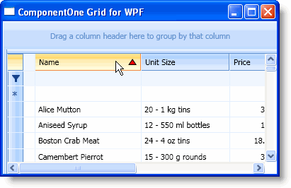
Click the column header again and note that the appearance of the descending sort indicator has also changed.
|
