Scheduler for WPF provides a specific visual data model that is intended to help in creating a user interface (UI). The UI building concept for C1Scheduler is similar to a grouped System.Windows.Controls.ItemsControl with a special ItemsControl.ItemsSource collection.
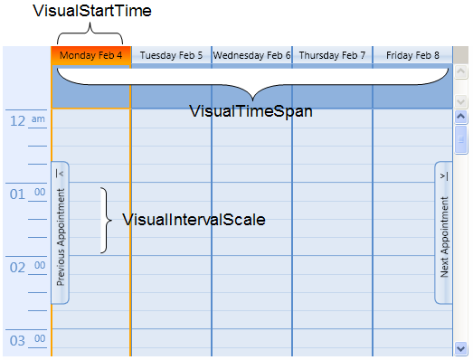
For example, the VisualStartTime sets the first date to appear in the schedule. The VisualTimeSpan property defines the amount of time, or in most cases, the number of days shown in a view. The VisualIntervalScale property breaks the VisualTimeSpan even further into increments.
Using the Working Week View view style as an example, the VisualStartTime is the first Monday of the current week, by default. The VisualTimeSpan is 5:00:00:00, or five days, Monday through Friday which is a typical work week. The VisualIntervalScale is 00:15:00 which means that each hour of the schedule is shown broken down into 15 minute intervals.
Note: The VisualStartTime property value is determined automatically by the VisualTimeSpan and SelectedDateTime properties, so it should not be set in most cases; however, the VisualTimeSpan and SelectedDateTime properties must be set. This is important for week and month views where the current date is not always the first date to appear in the schedule.
For specified VisualStartTime, VisualTimeSpan, and VisualIntervalScale properties, the VisualIntervalCollection is filled with VisualInterval objects, each defining a period of time of the VisualIntervalScale length.
The items in the VisualIntervalCollection can be grouped; grouping criteria is defined in the VisualIntervalGroupDescriptions collection, which contains one item per grouping level. A UI for each group level, which consists of a Header, a Panel containing group items, the group item's UI, and a layout that gathers these parts together, is defined in the VisualIntervalGroupStyles collection, which contains one item per grouping level.
To define the VisualInterval's UI representation, the VisualIntervalTemplate property should be used. The VisualIntervalPanel property defines a Panel where the VisualInterval's items are placed.
To provide a group view for the VisualIntervalCollection, the VisualIntervalsView property should be used, which is a System.Windows.Data.ListCollectionView derived object that has VisualInterval as the SourceCollection.
A DataContext for the VisualInterval's UI DataTemplate is the VisualInterval itself, so the construction {Binding property_name} in the DataTemplate XAML code means binding to the property_name property of VisualInterval.
A DataContext for the group item's UI DataTemplate is a VisualIntervalGroup object, which is derived from VisualInterval. A time period that is represented by this VisualIntervalGroup is a union of periods of child items (child groups or intervals). The only properties that it adds to the base class are:
• Group of type System.Windows.Data.CollectionViewGroup; this is a data object that represents a group item in the VisualIntervalCollectionView.Groups collection.
• VisualIntervals of type C1.WPF.C1Schedule.VisualIntervalCollection (a collection of child VisualInterval objects).
The VisualInterval class, among others, contains the Appointments collection that represents the appointments that intersect with the interval. This collection doesn’t contain Appointment instances directly; instead it holds the IntervalAppointment class instances, which in turn has a reference to an appointment they represent (the Appointment property), along with some helper properties for indication of whether this appointment starts in this interval, whether it’s finished here, and so on.
When the ControlTemplate for C1Scheduler is being created (C1Scheduler.Template), the C1SchedulerPresenter object should be used as a markup for a place where intervals and their groups will be shown.
For example, in order to define an Outlook-style Work Week view with 30-minute time intervals, you may use the following code:
C1Scheduler1.ChangeStyle(C1SchedulerResources.WorkingWeekStyle)
C1Scheduler1.VisualIntervalScale = TimeSpan.FromMinutes(30)
C1Scheduler1.VisualTimeSpan = TimeSpan.FromDays(5)
Group Level1
PropertyNames = "StartTime.Day" (group by VisualInterval.StartTime.Day)
GroupStyle = (Header: day name; Panel : some Panel with Horizontal orientation)
Group Level2
PropertyNames = "StartTime.Hour" (group by VisualInterval.StartTime.Hour)
GroupStyle = (Header: none; Panel : some Panel with Vertical orientation with a Border around)
VisualIntervalTemplate = something that reacts on double-click and calls a Command that brings an appointment creation dialog (NewAppointmentDialogCommand, see below).
The following XAML is an example of how to define groups:
<!—- Group descriptions -->
<Setter Property="VisualIntervalGroupDescriptions">
<Setter.Value>
<local:IntervalGroupDescriptionCollection>
<!—- Group Level1 – grouped by days -->
<local:VisualIntervalGroupDescription PropertyNames="StartTime.Day" />
<!—- Group Level2 – grouped by hours -->
<local:VisualIntervalGroupDescription PropertyNames="StartTime.Hour" />
</local:IntervalGroupDescriptionCollection>
</Setter.Value>
</Setter>
<!-- Group styles definition -->
<Setter Property="local:VisualIntervalGroupStyles">
<Setter.Value>
<local:IntervalGroupStyleCollection>
<!—- Group Level1 – grouped by days -->
<GroupStyle ContainerStyleSelector="{StaticResource DayGroupStyleSelector}">
<GroupStyle.HeaderTemplate>
<DataTemplate>
<Border Visibility="Collapsed" />
<!-- Header is drawn separately -->
</DataTemplate>
</GroupStyle.HeaderTemplate>
<!—- The group is a single row of days -->
<GroupStyle.Panel>
<ItemsPanelTemplate>
<UniformGrid SnapsToDevicePixels="True" Rows="1" />
</ItemsPanelTemplate>
</GroupStyle.Panel>
</GroupStyle>
<!—- Group Level2 – grouped by hours -->
<GroupStyle ContainerStyleSelector="{StaticResource TimeSlotGroupStyleSelector}">
<GroupStyle.HeaderTemplate>
<DataTemplate>
<Border Visibility="Collapsed" />
</DataTemplate>
</GroupStyle.HeaderTemplate>
<!—- The group is a single column of 24 hours -->
<GroupStyle.Panel>
<ItemsPanelTemplate>
<UniformGrid Rows="24" />
</ItemsPanelTemplate>
</GroupStyle.Panel>
</GroupStyle>
</local:IntervalGroupStyleCollection>
</Setter.Value>
</Setter>
To provide a custom look for the C1Scheduler control:
1. To define a general layout model for a C1Scheduler control, the C1Scheduler.Template property should be assigned. This is usually done through the Setter property of a Style. The template may contain any UI elements, but in some places of the template's visual tree, the following placeholder elements should appear:
• VisualIntervalGroupsPresenter - to designate a place where the collection of VisualIntervalGroup objects will appear;
• AppointmentsCoverPane – to provide a surface for drawing appointment boxes;
• C1SchedulerPresenter – to define a place where a pane representing schedule time intervals will appear.
Note that each of the placeholders enumerated above are optional.
2. To define grouping:
• Set VisualIntervalGroupDescriptions to define grouping criteria applied to the items of the VisualIntervalCollection;
• Set C1Scheduler.VisualIntervalGroupStyles to define a UI for each group level;
3. To define a layout of elements representing VisualInterval objects from the VisualIntervalCollection, set the VisualIntervalPanel property.
To define the VisualInterval representation, either set the VisualIntervalTemplate property or use the TimeSlotTemplateSelector.
|