The C1WebTopicBarItem Collection Editor allows you to view and modify your items. You can select from three different types of items in the Add button drop-down list: C1WebTopicBarItem, C1WebContentItem, and C1WebSeparator.
You can access the C1WebTopicBarItem Collection Editor by clicking on the ellipsis button in the Collections property of the C1WebTopicBarGroup Collection Editor. The editor below includes the collection of properties for C1WebTopicBar's items.
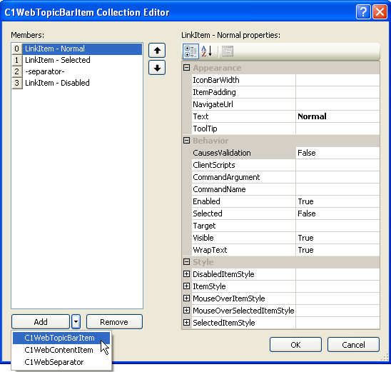
C1WebTopicBarItem
The following properties for the C1WebTopicBarItem type are available for the user in the C1WebTopicBarItem Collection Editor:
· C1WebTopicBarItem Appearance Properties
The appearance properties change the appearance of the item. The appearance properties and their functions are listed below:
|
Property |
Description |
|
IconBarWidth |
Sets or returns the width of the icon bar drawn on the side of the groups. |
|
ItemPadding |
Space between item's border and content. |
|
NavigateUrl |
Gets or sets the URL link once the hyperlink is clicked in the menu item. |
|
Text |
Gets or sets text which is displayed in the item header. |
|
ToolTip |
Gets or sets the ToolTip text displayed when the mouse pointer rests over the item. |
· C1WebTopicBarItem Behavior Properties
The behavior properties change the item's behavior. The behavior properties and their functions are listed below:
|
Property |
Description |
|
CausesValidation |
Determines whether validation is performed when the item is clicked. |
|
ClientScripts |
Collection of client-side scripts associated with the item. |
|
CommandArgument |
Gets or sets an optional parameter passed to the ItemClick and ItemSelected events of the C1WebTopicBar component along with the associated CommandName. |
|
CommandName |
Gets or sets the command name associated with the C1WebTopicBarItem passed to the ItemClick and ItemSelected events of the C1WebTopicBar component. |
|
Enabled |
Gets or sets a value indicating whether the group is collapsed or not. |
|
Selected |
Determines whether the item is selected or not. |
|
Target |
Gets or sets the target window or frame to display the link. |
|
Visible |
Gets or sets a value indicating whether the group is visible or not. |
|
WrapText |
Gets or sets a value that indicates whether the item's text is wrapped. |
· C1WebTopicBar Style Properties
The style properties change the item's style. The style properties and their functions are listed below:
|
Property |
Description |
|
DisabledItemStyle |
Default style for the items in the disabled state. |
|
ItemStyle |
Default style for the items. |
|
MouseOverItemStyle |
Default style for the items when the mouse hovers over them. |
|
MouseOverSelectedItemStyle |
Style for the child items when the mouse hovers over the selected item. |
|
SelectedItemStyle |
Default style for the items in the selected state. |
C1WebContentItem Properties
The following properties for the Content item type are available for the user in the C1WebTopicBarItem Collection Editor:
· C1WebContentItem Appearance Properties
The appearance property changes the appearance of the item. The appearance property and its function are listed below:
|
Property |
Description |
|
ItemPadding |
Space between item's border and content. |
· C1WebContentItem Style Properties
The style property changes the item's style. The style property and its function are listed below:
|
Property |
Description |
|
ItemStyle |
Default style for the items. |
C1WebSeparator Properties
The following properties for the C1WebSeparator item type are available for the user in the C1WebTopicBarItem Collection Editor:
· C1WebSeparator Style Properties
The style property changes the item's style. The style property and its function are listed below:
|
Property |
Description |
|
SeparatorStyle |
Style for the separator. |
Send comments about this topic to ComponentOne. Copyright © ComponentOne LLC. All rights reserved. |