You can customize the appearance of header cells. These tasks relate to customizing the appearance of header cells for rows or columns in the sheet:
- Customizing the Style of Header Cells
- Showing or Hiding Headers
- Customizing the Default Header Labels
- Customizing Header Label Text
- Setting the Size of Header Cells
- Customizing the Header Empty Areas
- Creating a Header with Multiple Rows or Columns
- Creating a Span in a Header
Headers provide labels to identify the columns and rows. They appear at the top (for columns) and to the left (for rows) of the data cells and are formatted differently to be clearly seen. You may customize the appearance of header cells as you would any of the cells in the spreadsheet component. When you work with row headers and column headers, you can manipulate the objects using the short cuts in code (RowHeader and ColumnHeader classes), or you can directly manipulate the model. Most developers who are not changing anything drastically find it easy to manipulate the short cut objects.
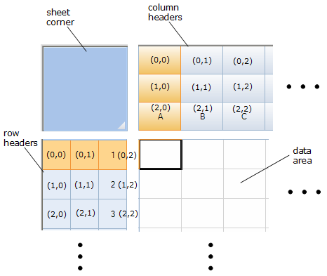
The figure below shows the parts of the headers and the coordinates of cells in headers that have multiple rows and columns.

For more information on the Cell and Cells objects, refer to the Assembly Reference.
For more information on models, refer to Using Sheet Models.
For information on footers, refer to Displaying a Footer for Columns or Groups.
Return to the overall list of tasks in Customizing the Appearance.


