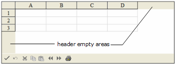
By default the component displays a color in the empty areas not filled in with column or row headers. These are the header empty areas as illustrated in the figure.

To customize the color of the header empty area, you can use the SheetView HeaderGrayAreaColor property. You can add images to the empty area with the HeaderGrayAreaBackgroundImageUrl property.
Return to Customizing the Appearance of Headers.
Using the Properties Window
- At design time, in the Properties window, select the Sheets property for the FpSpread component.
- Click the button to display the SheetView Collection Editor.
- In the Members list, select the sheet for which you want to set the color of the header empty area.
- Select the HeaderGrayAreaColor property (or HeaderGrayAreaBackgroundImageUrl and select an image) in the property list, and then click the drop-down button to display the color picker.
- Select a color in the color picker.
- Click OK to close the editor.
Using Code
Example
This example code sets the color or image properties for the gray area.
| C# |  Copy Code Copy Code |
|---|---|
// Set a color or an image for the gray area. FpSpread1.Sheets[0].HeaderGrayAreaBackgroundImageUrl = "happy.bmp"; //FpSpread1.Sheets[0].HeaderGrayAreaColor = Color.BurlyWood; |
|
| VB |  Copy Code Copy Code |
|---|---|
' Set a color or an image for the gray area. FpSpread1.Sheets(0).HeaderGrayAreaBackgroundImageUrl = "happy.bmp 'FpSpread1.Sheets(0).HeaderGrayAreaColor = Color.BurlyWood |
|


