| Visual Basic (Declaration) | |
|---|---|
Public Class CheckBoxCellType Inherits BaseCellType Implements FarPoint.Win.ISerializeSupport, ICellType, IEditor, IErrorIconSupport, IFormatter, INotifyEditorValueChanged, IPdfSupport, IPropertyAllowedSupport, IRenderer, IReuseEditorControl, IReuseEditorControl2, FarPoint.Win.Spread.IAllowArrowKeysMoveActiveCell, FarPoint.Win.Spread.IEnhancedPdfRenderer, FarPoint.Win.Spread.IEnhancedRenderer | |
| Visual Basic (Usage) |  Copy Code Copy Code |
|---|---|
Dim instance As CheckBoxCellType | |
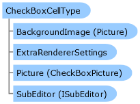
A check box cell provides a check box that can show two or three states. For a two-state check box, the box is either checked or unchecked. For a three-state check box, the box can be either checked, unchecked or indeterminate (gray).
Check box cells can display text alongside the check boxes as well as a caption for the cell. You can customize the colors in the cells, including the color of the border, text, and background.
Clicking anywhere in the cell clicks the check box.
Until the check box is set (checked or unchecked), the check box is not set and has a value of null.
For more information about setting the cell type, refer to Setting a Check Box Cell.
For more information about the behavior of contents in a cell of this type, refer to Understanding Cell Type Effects on Displaying Data.
For more information on the corresponding event when a user clicks on an option, refer to the FpSpread.ButtonClicked event.
System.Object
FarPoint.Win.Spread.CellType.BaseCellType
FarPoint.Win.Spread.CellType.CheckBoxCellType
Target Platforms: Windows 2000 Professional (SP4), Windows 2000 Server, Windows 2003 Server (SP1), Windows 2008, Windows XP (SP2), Windows Vista, Windows 7, Windows 8
Reference
CheckBoxCellType MembersFarPoint.Win.Spread.CellType Namespace
ButtonClicked Event
User-Task Documentation
Setting a Check Box CellWorking with Graphical Cell Types


